How do you create boxplots in Python’s seaborn? Why would you want to create boxplots in the first place? Perhaps you are working on outlier detection. Seaborn is built on top of Matplotlib.
Suppose your DataFrame is called df and suppose you have a column called my_col. Below is the code.
import matplotlib.pyplot as plt
import seaborn as sns
sns.boxplot(y="duration", data=df)
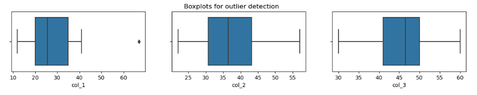
In the next example we’ll create three boxplots for three columns. We’ll set it up so that they are shown side by side. Suppose you have a DataFrame called df and in that DataFrame you have at least three columns called col_1, col_2 and col_3.
fig, axes = plt.subplots(1, 3, figsize=(15, 2))
fig.suptitle('Boxplots for outlier detection')
sns.boxplot(ax=axes[0], x=df['col_1'])
sns.boxplot(ax=axes[1], x=df['col_2'])
sns.boxplot(ax=axes[2], x=df['col_3'])
plt.show();
A Simple Example
import pandas as pd  # import the pandas library into Python
import matplotlib.pyplot as plt
import seaborn as sns
data = {'firstname': ['Bob', 'Sally', 'Suzie', 'Rohan', 'Sam', 'Linda', 'Susan', 'Gail'],
       'col_1': [12, 67, 33, 41, 17, 21, 23, 28],
       'col_2': [22, 57, 43, 44, 27, 38, 32, 35],
       'col_3': [30, 60, 44, 53, 32, 47, 49, 46]}
df = pd.DataFrame(data)
df
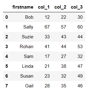
Click the screenshot below to see what it looks like in Jupyter notebook.
The searborn website says: “A box plot (or box-and-whisker plot) shows the distribution of quantitative data in a way that facilitates comparisons between variables or across levels of a categorical variable. The box shows the quartiles of the dataset while the whiskers extend to show the rest of the distribution, except for points that are determined to be “outliers” using a method that is a function of the inter-quartile range.”