- Bar Charts in Tableau
- Stacked Bar Chart in Tableau
- Stacked Bar Chart 2 in Tableau
- Bar Chart with Hierarchy
- Shared Axis Bar Chart
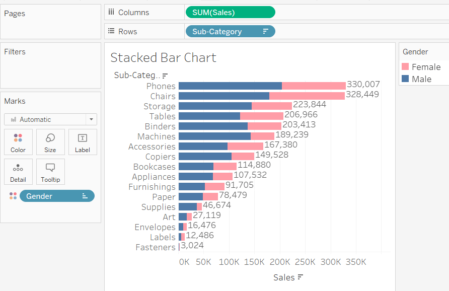
We need to create a horizontal bar chart displaying Sales split by Gender and Sub-category. The sub-category in our dataset, the Superstore dataset, is a type of product, such as bookcases.
- one quantitative variable (column) – Sales
- two categorical variables (columns) – Gender and Sub-category
It’s easy to see how this is built. Sales in the columns, Sub-Category in the Rows and Gender in the Color Mark.
To edit the colors, click on the color Mark and then click Edit Colors. To edit the colors you first need to select the item on the left and then pick a color. After selecting, click OK.
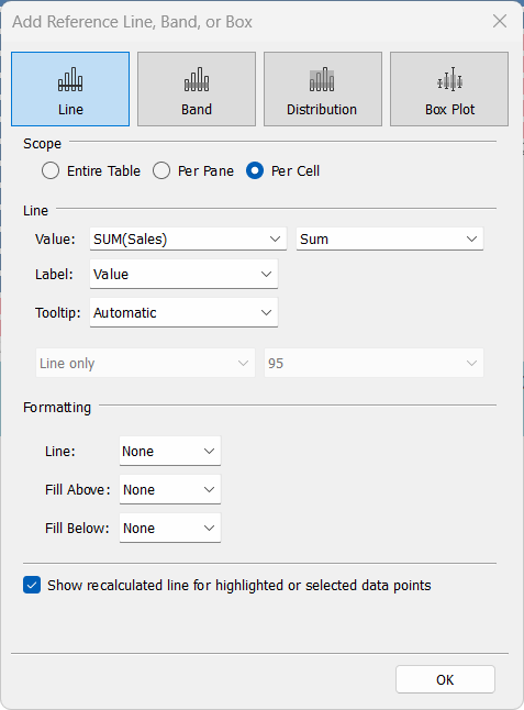
To add the dollar amounts to the right of each horizontal bar, you need to add a reference line and format it. Right-click the x-axis at the bottom and click Add Reference Line. Make some changes as per the screenshot below. Right click on one of the values and choose format. Set Line to None to make the small vertical line disappear. It looks cleaner.