- Getting Started with Tableau
- Tableau’s Dimensions and Measures
- Shelves and Cards in Tableau
- The Filters Shelf in Tableau
Tableau, the popular visualization software, uses the terms dimensions and measures. What do these mean? First of all it’s a good idea to become familiar with the concepts of structured data.
Dimensions are descriptive (or categorical or qualitative) fields and Measures are numerical (quantitative) fields. Descriptive data includes things like names, dates, product names, product types, geographical places, categories, types, shipping method, identification numbers, and so on. Measures are numbers. Measures can be aggregated (combined). Measures are things you can quantify (how many or how much). When you drag a measure on to the view, Tableau will automatically apply an aggregation to that view. It’s SUM by default.
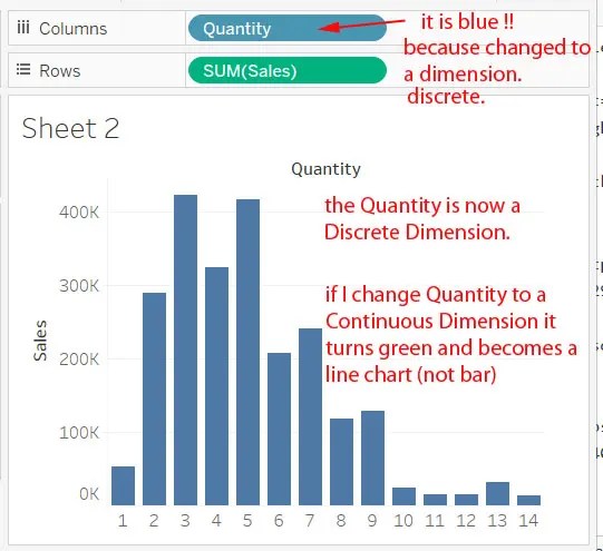
Green and Blue
Green represents continuous data and blue represents discrete data. Discrete data are individually separate and distinct, whereas continuous data forms an unbroken whole without interruption. If you weigh something, like a penguin, you have a continuous value.
![]()
![]()
By default, Tableau uses discrete (blue) dimensions and continuous (continuous) measures. This makes sense because a dimension (category) is discrete and a measure (weight/mass etc) is continuous. You will see that dimension are blue and measures are green, but it’s not that simple because I’ve previously said that blue means discrete and green means continuous.
If we have a green, it’s continuous and in our chart we see specific labels (1,2,3,4,5 and so on), not an axis.
Measures
In general, measures are numbers and dimensions are not. However, sometimes a dimension is a number, such as row ID. Why do we have a number in the dimensions section when really it is a number? If you can do meaningful calculations on the field, it should be in the measures section. You cannot do meaningful calculation on a customer ID number. You cannot add up customer numbers to derive meaningful insights. When Tableau sees the field has “ID” as part of its name, it will classify it as a dimension (the top section).
Drag fields from dimensions to measures. If for some reason you want to aggregate the Customer ID, just drag it down. But that’s not something you would normally not do.

Add more rows to your table just by double-clicking more measures. You might be thinking that it would be nice to have a row of data that is for expenses that takes the sales and subtracts the profit. That is called a calculated field.

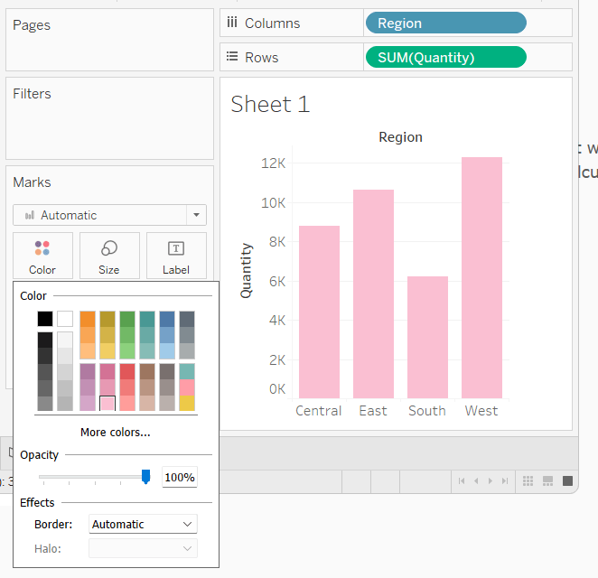
If you really just wanted a bar chart, here is how that would look. I have changed the color by clicking the Color mark and choosing pink.
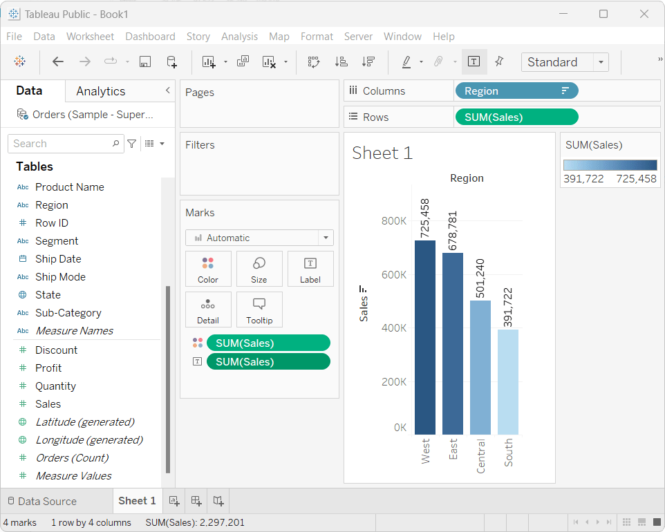
Sales by Region would be a common visualization to do. I have sorted descending by clicking on the sort icon (just under the menu item Server). Sales is in the rows, color and the label, as shown below.