The bar chart is perhaps the most used and most popular chart. It is very popular in data analytics. This post and it’s series of posts is about creating bar charts in Tableau.
We have another series of posts here called Starting with Tableau. The first post in that series is Getting Started with Tableau.
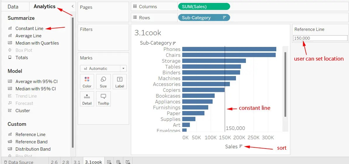
To create the reference line (constant line), click the analytics tab and drag the Constant Line over onto the visualization. Type a number into the small popup box and press Enter. You can leave it as-is, unless you want to change it into a user-controlled reference line.
The user can enter a parameter to change the location of the line if we make it a user-controlled line. How do we do that? Right-click on the axis and click Edit Reference Line. Click the drop down to change Constant to Sum. Click the Value drop-down and change SUM(Sales) to Create a new parameter. Rename the parameter and change the current value to a certain amount. Click OK. Customize the reference line by changing the Label drop-down to Value then click Ok.
When you add a new parameter via a reference line, Tableau automatically displays the parameter control which is a GUI mechanism allowing the user to adjust the reference line.
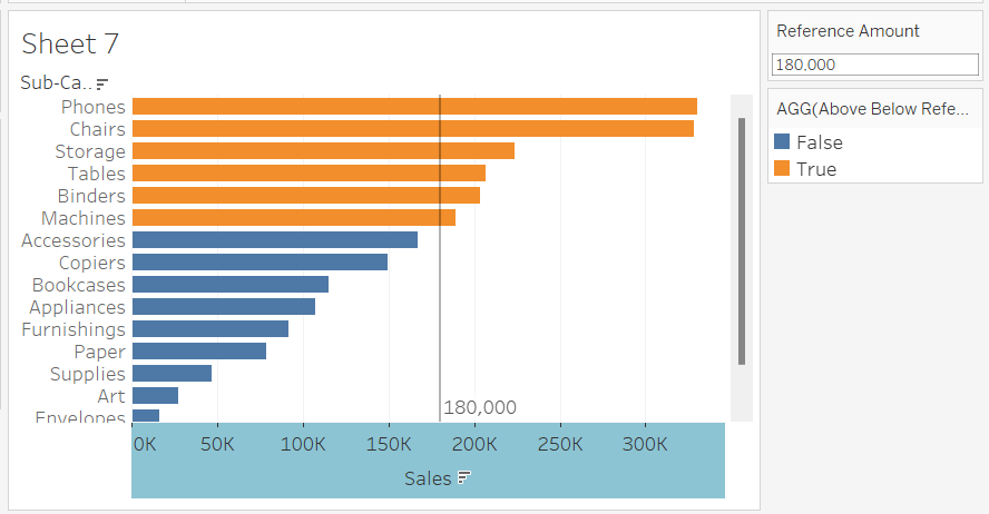
Add Color to the Reference Line
You can have a different color for the bars that appear above the reference line. You do this with a new calculated field. You can call it Above Below Reference Line.
Create a new Calculated Field. To do that, click the Data tab. Click the small down arrow just below that. Click Create Calculated Field. Name it. In the larger box below type the formula. Assuming you called it Reference Amount your formula would be SUM([Sales]) >= [Reference Amount]. Click Ok.
Users can now easily see which sub-categories are above and below the reference line (reference amount). Tableau’s automatic colors for a Boolean calculation are orange and blue, because they are the first colors in Tableau’s default color palette.