The bar chart is one of the most common and most important charts.
I will loosely follow Corey Schafer’s video (link is below) when I build these graphs. I created a project called Bar Charts in Matplotlib in Anaconda Navigator’s Jupyter Notebook on my local Windows computer. We use the bar() method instead of the plot method. So we write plt.bar().
# https://youtu.be/nKxLfUrkLE8?si=uu6gALS02-pF5Aqo
import numpy as np
import matplotlib.pyplot as plt
# ten observations, each in a list
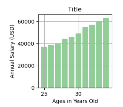
ages_x = [25, 26, 27, 28, 29, 30, 31, 32, 33, 34]
sal_y = [37000, 38900, 40012, 44200, 46000, 49000, 54900, 57012, 60200, 63000]
print('The data type of ages_x is: {}', type(ages_x))
The output of the print statement is: The data type of ages_x is: {}
plt.figure(figsize =(2.5, 2.5))  # width and height of graph
plt.title('Title')
plt.xlabel('Ages in Years Old')
plt.ylabel('Annual Salary (USD)')
plt.grid()
plt.plot
plt.bar(ages_x, sal_y, color="#90CD97")
The Jupyter Notebook output screenshot is shown below.
Learn with YouTube
Here’s a video by Corey Schafer called Matplotlib Tutorial (Part 2): Bar Charts and Analyzing Data from CSVs.