Do you want to become more familiar with producing histograms in the matplotlib library of Python? I created a project called Histogram of Random Data with Matplotlib in Anaconda’s Navigator.
import numpy as np
import matplotlib.pyplot as plt
# The average height is 178 cm
# the std deviation is 7.5 cm
mu, sigma = 178, 7.5
x = mu + sigma * np.random.randn(5000)
# Let's plot a subset of the data
fig = plt.figure(figsize =(4, 3))  # width and height of graph
plt.hist(x, 200, facecolor='blue', density=True)
plt.ylabel('Percent')
plt.xlabel('Height in cm')
plt.title("Distribution of Canadian Men's Heights (cm)")
plt.text(150,0.04,'mean = 178')
plt.text(150,0.035,'std dev = 7.5')
plt.grid(True)
plt.show()
Below is what was produced in Jupyter Notebook. Remember that this is not researched data, it’s just random data.
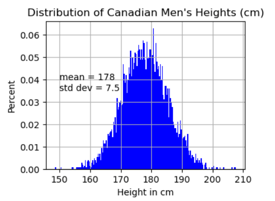
Let’s generate random data on people’s heights in centimeters for men in Canada.
Learn with YouTube
Here is a video. Matplotlib Tutorial (Part 6): Histograms with Cory Schafer.