Let’s create a very simple pie chart using the Python library matplotlib. There is however some controversy with pie charts. Many people don’t like them and would suggest using a bar chart instead. They argue that it can be difficult to see the largest slice when the top two slice sizes are nearly the same amount. Probably, pie charts should be used with two, three or four categories only. I will jump right into the basic code. I’m using Anaconda Navigator’s Jupyter Notebook on my local Windows machine.
# imort matplotlib's pyplot
import matplotlib.pyplot as plt
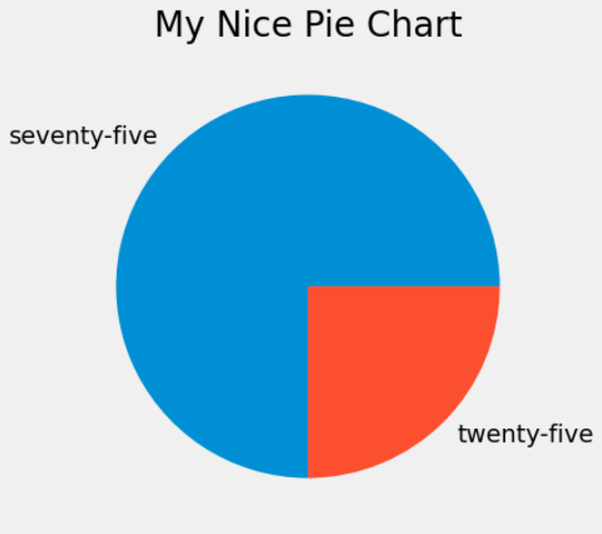
Let’s build a simple pie chart.
plt.style.use("fivethirtyeight")
plt.title("My Nice Pie Chart")
plt.tight_layout()
slices = [75,25]
labels = ['seventy-five','twenty-five']
plt.pie(slices, labels=labels)
plt.show()
Here is a screenshot.
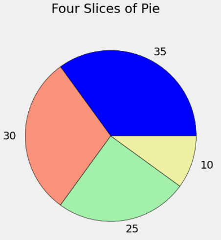
Let’s change the data and add borders between the slices. We’ll also change the colors. It’s nice to have colors that are not as intense. I also changed the title to suptitle because I got an error that said: “TypeError: ‘str’ object is not callable”. StackOverflow helped with this.
# Colors: (Just some random hex colors here)
Blue = '#008fd5'
Red = '#F8927B'
Yellow = '#EEF0A3'
Green = '#A3F0AB'
slices = [35,30, 25, 10]
labels = ['35','30','25','10']
colors = ['blue', Red, Green, '#EEF0A3']
plt.suptitle("Four Slices of Pie")
plt.pie(slices, labels=labels, colors=colors, wedgeprops={'edgecolor': 'black'})
plt.show()
Here is the screenshot.
Manually Created DataFrame – Pie Chart with Explode
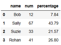
Let’s create a small DataFrame and create a pie chart from the data.
import pandas as pd
# manually create a new DataFrame
data = {'name': ['Bob', 'Sally', 'Suzie', 'Rohan'],
       'num': [12, 67, 33, 41]}
df = pd.DataFrame(data)
# create a percentage column (new column)
total = df['num'].sum()
df['percentage'] = ((df['num'] / total) * 100).round(2)
df['percentage'].sum()
Below is our current DataFrame.
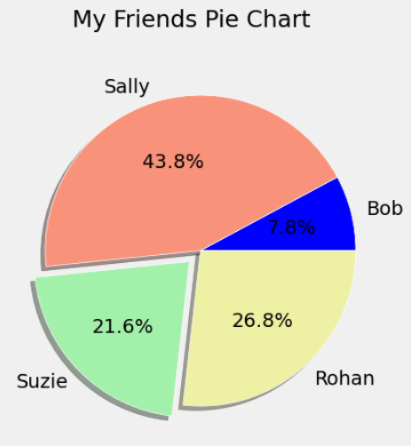
Let’s create and show a pie chart. I have brought back the colors in the code.
# Create and show a pie chart
explode = [0, 0, 0.1, 0]
slices = list(df['percentage'])   # list() function
labels = list(df['name'])
Blue = '#008fd5'; Red = '#F8927B';  Green = '#A3F0AB'; Yellow = '#EEF0A3' # random hex colors here
colors = ['blue', Red, Green, '#EEF0A3']  # blue is not a hex color here
plt.style.use("fivethirtyeight")
plt.suptitle("My Friends Pie Chart")  # title may throw an error
plt.tight_layout()
plt.pie(slices, labels=labels, explode=explode, shadow=True, colors=colors, autopct='%1.1f%%', wedgeprops={'edgecolor': 'white'})
plt.show()
Here below is the screenshot.