Are you are a data professional who is interested in generating a histogram in Python? Suppose you are actually working with a dataset in pandas and you’d like to visualize a single column that is categorical.
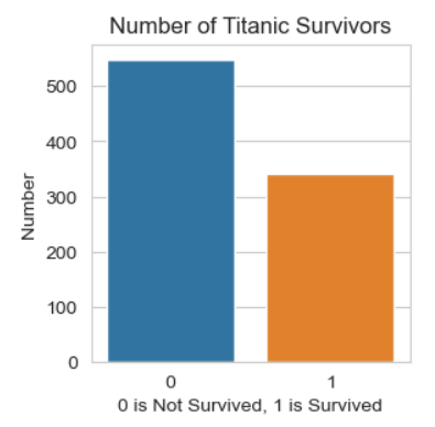
Let’s use the Titanic dataset as an example dataset. This dataset is available on Kaggle. All we want to do here is create a simple bar chart of the number of people who survived against those who did not survive.
Count Plot in Seaborn with countplot
You can create this project at home. I’m using Anaconda Navigator to run Jupyter Notebook in the browser. I’ve downloaded the dataset and stored the files in the appropriate folder, which in Windows would be under the C drive under the username. I created a project called Histogram of Categorical Survived.
import numpy as np
import pandas as pd
import matplotlib.pyplot as plt
import seaborn as sns
df = pd.read_csv(r"titanic_train.csv")
df_test = pd.read_csv(r"titanic_test.csv")
plt.figure(figsize =(3, 3))  # width and height of graph
plt.title('Number of Titanic Survivors')
sns.set_style('whitegrid')
cp = sns.countplot(x='Survived', data=df)
cp.set(xlabel='0 is Not Survived, 1 is Survived', ylabel='Number')