- Excel Chart x Axis Showing Series
- Excel Chart Hiding Data
- Excel Simple Combo Chart
- Excel Chart Formatting
- Choosing a Chart Type
Have you ever been frustrated with creating a simple graph showing years in one column and a bunch of values in the next column? When you create the graph, the x-axis along the bottom of the chart shows a series of numbers 1, 2, 3 and so on instead of the years. You want to see the years listed on the x-axis instead of the series of numbers that Excel automatically provides.
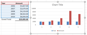
In the graphic below, all I’ve done is select the data, including the column titles and not the grand total, and then I’ve selected Clustered Column chart from the Insert menu. My example is shown below, but you can see a similar example over at Stack Overflow. The article is called Excel chart x axis showing sequential numbers, not actual value.
Here are some screenshots. Click on them to enlarge them. In the screenshot below, I want the years to be along the x-axis, not the series of numbers 1 to 5. This below is not what we want.
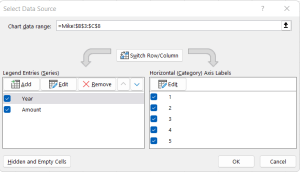
The way to fix this is to select Select Data from the Chart Design menu. You will see something like the following.
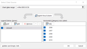
You need to do two things. First, just remove the Legend Entries (Series). Secondly, we need to click the Edit button for the Horizontal (Categry) Axis Labels. Specify the range, which in this case is the 2006, 2007, 2008 and so on. Your dialog box should be similar to what’s shown below.
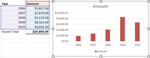
Below is the fixed chart.


