- Excel Chart x Axis Showing Series
- Excel Chart Hiding Data
- Excel Simple Combo Chart
- Excel Chart Formatting
- Choosing a Chart Type
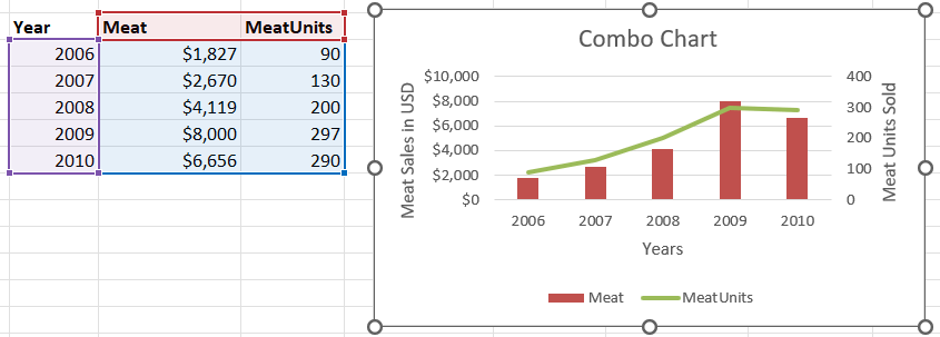
What is an Excel Combo chart? A combo chart in Excel displays two chart types (such as column and line) on the same chart. They are used to show different types of information on a single chart. Sometimes you want to show sales in dollars and units. If the price per unit is high, like a car, then showing both on the same axis would result in the units being hardly visible because the numbers would be so much smaller. In the Microsoft website example they show a bicycle sales chart that shows units sold and the average price per unit.
Below is what the Data Source looks like. Note that the Year is not in the Legend Entries list on the left side.

If you click on the change chart type and select the Combo Chart at the bottom on the left side, you can make adjustments so that your chart looks something like the screenshot below.
