
Line Chart World Indicators
Here is an example of a line chart using Tableau’s World Indicators dataset. World Indicators come packaged with […]
Here is an example of a line chart using Tableau’s World Indicators dataset. World Indicators come packaged with […]
Florence Nightingale saved lives by creating revolutionary visualizations of statistics. Yes, data visualizations are that powerful. They are […]

Line charts (graphs) are one of the more important and useful charts in Tableau. They are used to […]
It is advised to eliminate any clutter in your data visualizations. This makes sense. Clutter distracts from the […]
The book Storytelling with Data by Cole Nussbaumer Knafflic is the title of a very popular book. It’s […]

The line chart is useful and popular. It is very popular in data analytics when you are observing […]
Visualizing data is the most intuitive way to interpret it, so it’s an invaluable skill. It is much […]
What is seaborn? Seaborn is a visualization library for making statistical graphics in Python. It builds on top […]

How do you take a pandas DataFrame of data (dataset) and produce a multi-column bar chart? You can […]

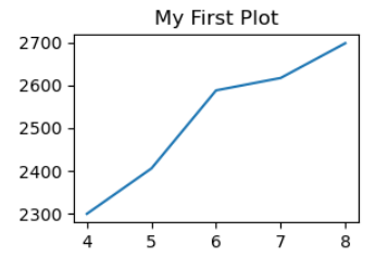
Matplotlib is a library in Python language. In order to write this blog post I created a new […]
Exploratory Data Analysis (EDA) has six main practices. The six main practices of EDA are discovering, structuring, cleaning, […]
Matplotlib is a low level graph plotting library in python that serves as a visualization utility. Matplotlib was […]