- Excel Chart x Axis Showing Series
- Excel Chart Hiding Data
- Excel Simple Combo Chart
- Excel Chart Formatting
- Choosing a Chart Type
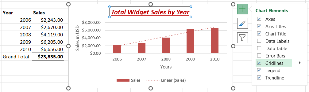
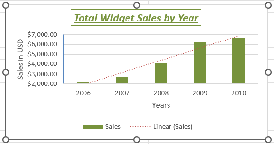
As an example I will use a simple column chart with only one series of data. It shows sales in dollars of widgets by year.
I have created the chart by first selecting the data and then inserting a clustered column chart. I then selected the Select Data button, removed the year and edited the horizontal categories to select the list of years starting with 2006.
I then made sure the chart was selected and clicked the plus sign in the upper left corner and added the axis. I also formatted the chart tile by first selecting it and clicking the Home menu. Here I am back to my familiar bold, italic, and underline formats which I can use along with other formats. Below is a screenshot of my progress.
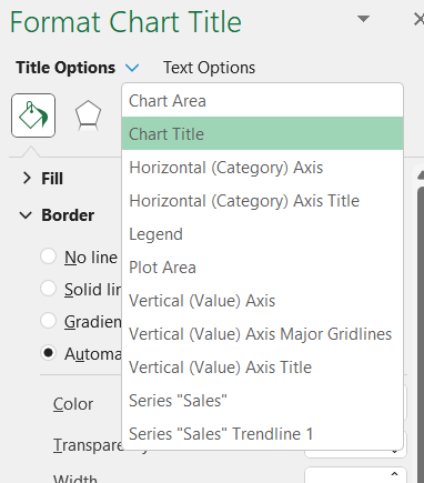
If you right-click the title of the chart you will find several options, one of which is Format Chart Title. That opens up a window on the right side that has several options in it. It has Title Options and Text Options, as shown in the screenshot below.

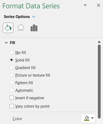
As you can see from the screenshot below, this gives you access to a lot of other options.
I have changed the series fill color from red to green, as shown below.
Axis Options
An important formatting feature is the axis options that allow you to specify a starting point and ending point. This affects how viewers first interpret the data. If the axis does not start at zero, for example, that will influence the viewer’s perception.
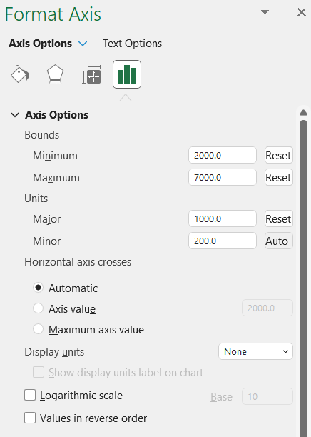
After changing the minimum and maximum amounts it affects how the chart appears.
Data Table
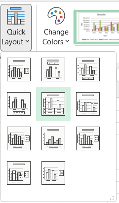
At the bottom of the chart you might want to include a data table that shows the exact numbers. One way to do this is to use the Quick Layout under the Chart Design menu. There are several options here.
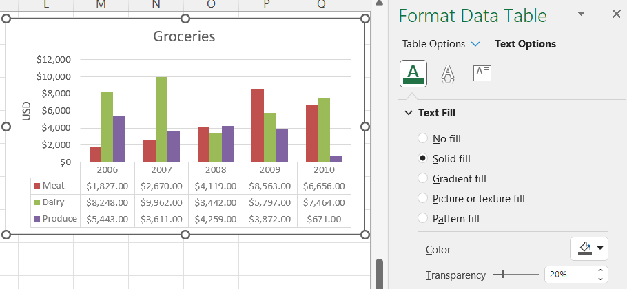
Another way is to use the Add Chart Element under the Chart Design menu. Here is what the data table looks like. I have added some transparency to the data table to make it lighter in color.
Bar Width
Suppose you have a bar chart and you want to adjust the width of the bars and also adjust the gap between the sets of bars. Click on one of the sets of bars in your chart. Right-click and select format data series. I have increased the gap width to a higher percent to create more white space between the months. Also, I have made the series overlap a very low negative number so that the region bars are very close together with a small white space between them. The screenshot below shows this.
