This post will discuss the building of a logistic regression model on the Titanic dataset provided by Kaggle. The algorithm here is based on a course at Udemy called Python for Data Science and Machine Learning Bootcamp. The instructor’s name is Jose Portilla. I have made some small changes to that code.
I made a project in Jupyter Notebook called Titanic – Whole Project – Udemy Logistic Regression. I installed Anaconda Navigator on my local Windows 11 computer to be able to create these Python projects.
import numpy as np
import pandas as pd
import matplotlib.pyplot as plt
import seaborn as sns
df = pd.read_csv(r"titanic_train.csv")
df_test = pd.read_csv(r"titanic_test.csv")
Below is the data dictionary.
- PassengerId – passenger id
- Survived – 0 = No, 1 = Yes
- Pclass – Ticket class 1 = 1st, 2 = 2nd, 3 = 3rd
- Name – name
- Sex – Male or Female
- Age – Age in years
- Sibsp – # of siblings / spouses aboard the Titanic
- Parch – # of parents / children aboard the Titanic
- Ticket – Ticket number
- Fare – Passenger’s fare
- Cabin – Cabin number
- Embarked – Port of Embarkation C = Cherbourg, Q = Queenstown, S = Southampton
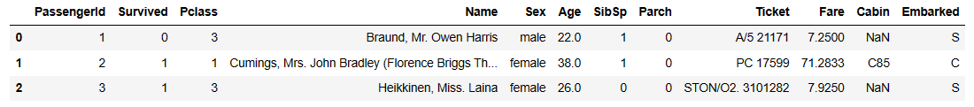
df.head(3)
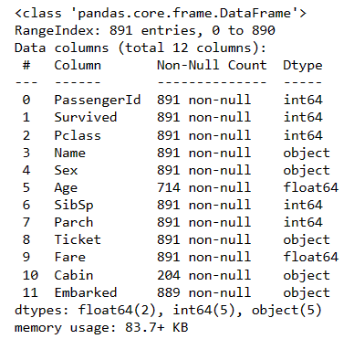
df.info()
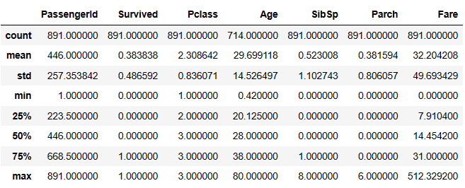
# If you had a lot of columns, you could transcribe them to make them fit better on screen
# In this case we don't need it but I will show it as an illustration
# df.describe().T
df.describe()
sns.set_style('whitegrid')
plt.figure(figsize=(2, 2)) # w, h
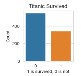
ax = sns.countplot(x='Survived', data=df)
ax.set_title('Titanic Survived')
ax.set_ylabel('Count')
ax.set_xlabel('1 is survived, 0 is not')
plt.figure(figsize=(3, 3))
pt = sns.countplot(x='Survived', hue='Sex', data=df, palette='RdBu_r') # palette is optional
pt.set_title('Titanic Survived by Sex')
pt.set_ylabel('Count')
pt.set_xlabel('1 is survived, 0 is not')

plt.figure(figsize=(3, 3))
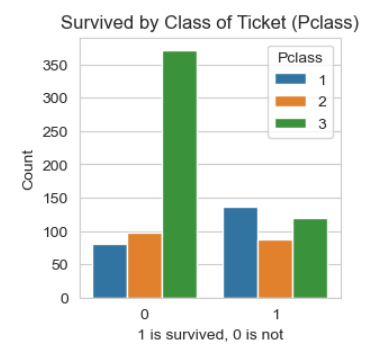
pt = sns.countplot(x='Survived', hue='Pclass', data=df) # df is training data
pt.set_title('Survived by Class of Ticket (Pclass)')
pt.set_ylabel('Count')
pt.set_xlabel('1 is survived, 0 is not')
EDA for Numeric and Categorical Variables
Let’s focus in on the columns of categorical variables and numeric variables. First we’ll break down features into numerical and categorical by creating two new DataFrames. Thanks to Ken Jee for this idea that I found in his YouTube video called Beginner Kaggle Data Science Project Walk-Through (Titanic).
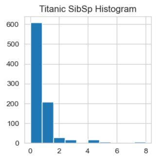
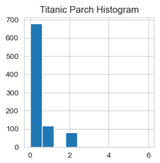
df_num = df[['Age', 'SibSp', 'Parch', 'Fare']]  # histograms
df_cat = df[['Survived','Pclass','Sex','Ticket','Embarked']]  # value counts
# Histogram distribution of all Numberic variables
for i in df_num.columns:
    plt.figure(figsize=(3, 3))  # put this first in the loop
    plt.hist(df_num[i])
    plt.title("Titanic " + i + " Histogram")
    plt.show()
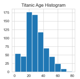
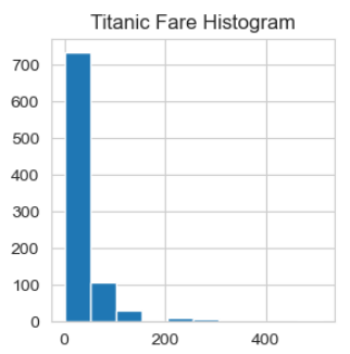
Thanks to Ken Jee for mentioning that we might want to normalize Fare.
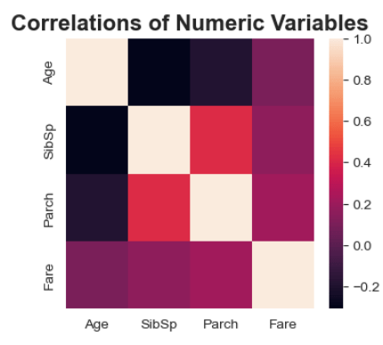
Correlations
print(df_num.corr())
            Age     SibSp     Parch      Fare
Age    1.000000 -0.308247 -0.189119  0.096067
SibSp -0.308247  1.000000  0.414838  0.159651
Parch -0.189119  0.414838  1.000000  0.216225
Fare   0.096067  0.159651  0.216225  1.000000
We would conclude that the class of ticket and the sex of the passenger would have a bearing on your chances of survival. Also perhaps if you have parents of children on the ship with you that would also have a bearing on your chances of survival.
plt.figure(figsize=(4, 3.5))
hm = sns.heatmap(df_num.corr())
hm.set_title('Correlations of Numeric Variables', fontsize=16, weight='bold')
# Survival Rate and the Average Numbers across Age, SibSp, Parch, Fare
pd.pivot_table(df, index = 'Survived', values = ['Age', 'SibSp', 'Parch', 'Fare'], aggfunc="mean")
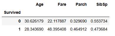
If someone survived, the average age was 28.3 years old. If they didn’t survive, the average age was 30.6 years. The numbers are fairly close, indicating that age didn’t matter much. The fare you paid did matter as to your chances of surviving. From this we can say that age doesn’t really matter as to your survival rate. The fare you paid for your ticket definitely matters as to your survival rate. The more you paid, the higher the survival rate. Having parents or children on board with you increased your chances of survival, but having a brother or sister on board with you did not increase your chances of survival.
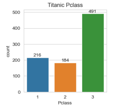
# Thanks to Ken Jee's video for the for loop below.
# I have changed his plot to sns.countplot()
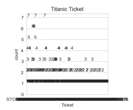
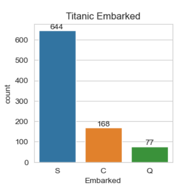
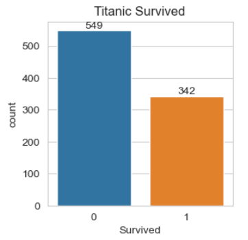
for i in df_cat.columns:
plt.figure(figsize=(3.1, 3.1))
ax = sns.countplot(x=df_cat[i], data=df_cat)
ax.bar_label(ax.containers[0])
plt.title("Titanic " + i)
plt.show()

# Thanks to Ken Jee for this code
print(pd.pivot_table(df, index='Survived', columns='Pclass', values = 'Ticket', aggfunc='count'))
print()
print(pd.pivot_table(df, index='Survived', columns='Sex', values = 'Ticket', aggfunc='count'))
print()
print(pd.pivot_table(df, index='Survived', columns='Embarked', values = 'Ticket', aggfunc='count'))
Pclass      1   2    3
Survived
0          80  97  372
1         136  87  119

Sex       female  male
Survived
0             81   468
1            233   109

Embarked   C   Q    S
Survived
0         75  47  427
1         93  30  217
Missing Data
plt.figure(figsize =(4, 4))
hm = sns.heatmap(df.isnull(), yticklabels=False, cbar=False, cmap='viridis')
hm.set_title('Histogram of Missing Data')
hm.set_ylabel('')
hm.set_xlabel('Columns (features)')
plt.figure(figsize=(4,3))
sns.boxplot(x='Pclass', y='Age', data=df)  # df is training data
Data Cleaning
# Impute the Age Column
# Let's get the median ages of each of the classes
series_median_age_by_class = df.groupby(by="Pclass")['Age'].median()
series_median_age_by_class
# write a function to impute the age column
def impute_age(cols):
    Age = cols[0]
    Pclass = cols[1]

    if pd.isnull(Age):

        if Pclass == 1:
            return 37

        elif Pclass == 2:
            return 29

        else:
            return 24

    else:
        return Age
df['Age'] = df[['Age','Pclass']].apply(impute_age,axis=1)
plt.figure(figsize =(4, 3))
sns.heatmap(df.isnull(),yticklabels=False,cbar=False,cmap='viridis')
df.drop('Cabin',axis=1,inplace=True)
df.head(3)
plt.figure(figsize =(4, 4))
sns.heatmap(df.isnull(),yticklabels=False,cbar=False,cmap='viridis')
df.dropna(inplace=True)
plt.figure(figsize =(4, 4))
sns.heatmap(df.isnull(),yticklabels=False,cbar=False,cmap='viridis')
df.info()
pd.get_dummies(df['Sex'])
df.head(3)