Our objective in this post is to use an example by Adam Nathan to learn how to create a circular button with a linear gradient brush that also responds to a trigger when the user moves the mouse over the button and responds to another trigger when the user clicks the button. We will be using control templates to make this happen. All of this will be done in XAML code. All we would need to do is write the Click event in the code-behind.
Just like Styles, Templates can contain all types of triggers in a Triggers collection. This example is from Adam Nathan’s book called WPF 4.5 Unleashed by Sams in chapter 14 on pages 432 – 434.
Simple Example
Here is a simple example that we can easily see the code. The results are just a light blue circle.
    <Grid>
        <Grid.Resources>
            <ControlTemplate x:Key="btnTemplate">
                <Grid>
                    <Ellipse Width="80" Height="80" Fill="LightBlue"/>
                </Grid>
            </ControlTemplate>
        </Grid.Resources>
        <Button Template="{StaticResource btnTemplate}" Click="Button_Click">Ok</Button>
    </Grid>
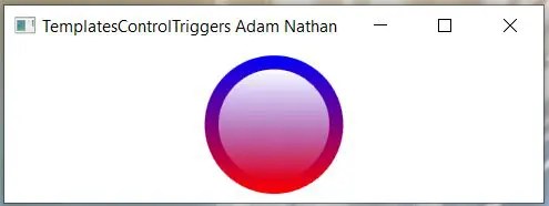
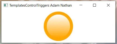
Below are the two screenshots: When the program starts and when the user hovers their mouse over the button.
When the user hovers the mouse over the button it turns orange.
<Window x:Class="TemplatesControlTriggers.MainWindow"
        xmlns="http://schemas.microsoft.com/winfx/2006/xaml/presentation"
        xmlns:x="http://schemas.microsoft.com/winfx/2006/xaml"
        xmlns:d="http://schemas.microsoft.com/expression/blend/2008"
        xmlns:mc="http://schemas.openxmlformats.org/markup-compatibility/2006"
        xmlns:local="clr-namespace:TemplatesControlTriggers"
        mc:Ignorable="d"
        WindowStartupLocation="CenterScreen"
        Title="TemplatesControlTriggers Adam Nathan" Height="150" Width="350">
    <Grid xmlns="http://schemas.microsoft.com/winfx/2006/xaml/presentation" xmlns:x="http://schemas.microsoft.com/winfx/2006/xaml">
        <Grid.Resources>
            <ControlTemplate x:Key="buttonTemplate">
                <Grid>
                    <Ellipse x:Name="outerCircle" Width="100" Height="100">
                        <Ellipse.Fill>
                            <LinearGradientBrush StartPoint="0,0" EndPoint="0,1">
                                <GradientStop Offset="0" Color="Blue"/>
                                <GradientStop Offset="1" Color="Red"/>
                            </LinearGradientBrush>
                        </Ellipse.Fill>
                    </Ellipse>
                    <Ellipse Width="80" Height="80">
                        <Ellipse.Fill>
                            <LinearGradientBrush StartPoint="0,0" EndPoint="0,1">
                                <GradientStop Offset="0" Color="White"/>
                                <GradientStop Offset="1" Color="Transparent"/>
                            </LinearGradientBrush>
                        </Ellipse.Fill>
                    </Ellipse>
                </Grid>
                <ControlTemplate.Triggers>
                    <Trigger Property="Button.IsMouseOver" Value="True">
                        <Setter TargetName="outerCircle" Property="Fill" Value="Orange"/>
                    </Trigger>
                    <Trigger Property="Button.IsPressed" Value="True">
                        <Setter Property="RenderTransform">
                            <Setter.Value>
                                <ScaleTransform ScaleX=".9" ScaleY=".9"/>
                            </Setter.Value>
                        </Setter>
                        <Setter Property="RenderTransformOrigin" Value=".5,.5"/>
                    </Trigger>
                </ControlTemplate.Triggers>
            </ControlTemplate>
        </Grid.Resources>
        <Button Template="{StaticResource buttonTemplate}">OK</Button>
    </Grid>
</Window>