- Logistic Regression Introduction
- Binomial Logistic Regression
- Logistic Regression in Python
This Python project example was done using Jupyter Notebook in Anaconda Navigator with made-up fake made-up data on the incidence of arthritis in patients. I created a project called Logistic Regression Arthritis Fake Data. I did this project on my local machine. This project example is here to help us understand what the algorithm might be for your own project.
This project is based on projects in the course at Coursera called Google Advanced Data Analytics, Regression Analysis: Simplify Complex Data Relationships. Since we are now actually constructing the model, we are in the Construct phase of Google’s PACE Framework.
Made-up Fake Arthritis Data
Below is the Python project. I will move quickly through it by combining code cells together. In a real project, you would split some of these cells and include more explanation. I also have not included all of the explanatory notes that I could have. The notes are in markdown cells. The data is fake and very contrived. You can see that the ages are just a series of numbers in order starting at age 20 and going up by one year each observation.
# import
import pandas as pd
import matplotlib.pyplot as plt
import seaborn as sns
import sklearn.metrics as metrics # Import the metrics module from scikit-learn
# Load in if csv file is in the same folder as notebook
arth = pd.read_csv("LogRegressArthritis.csv")
df = arth.copy()
pd.set_option('display.max_rows', 50)
pd.set_option('display.max_columns', 50)
df.head(25).T   # dot T transposes
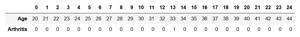
Download the LogRegressArthritis.csv I used. Download it if you wish. In our data, a value of zero in the Arthritis column means that the person does not have arthritis, and one means they do have arthritis.
# Load in sci-kit learn functions for constructing logistic regression
from sklearn.model_selection import train_test_split
from sklearn.linear_model import LogisticRegression
# Save X and y data into variables
X = df[["Age"]]
y = df[["Arthritis"]]
# Split dataset into training and holdout datasets
X_train, X_test, y_train, y_test = train_test_split(X,y, test_size=0.3, random_state=4)
clf = LogisticRegression().fit(X_train,y_train)
# Print the coefficient
clf.coef_

# Print the coefficient
clf.coef_
array([[0.03329781]])
# Print the intercept
clf.intercept_
array([-3.1602916])
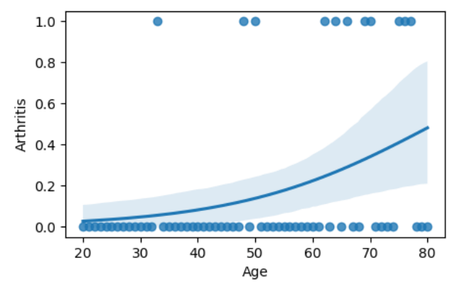
# Plot the logistic regression and its confidence band
fig, ax = plt.subplots()
fig.set_size_inches(5, 3)
sns.regplot(x="Age", y="Arthritis", data=df, logistic=True, ax=ax)
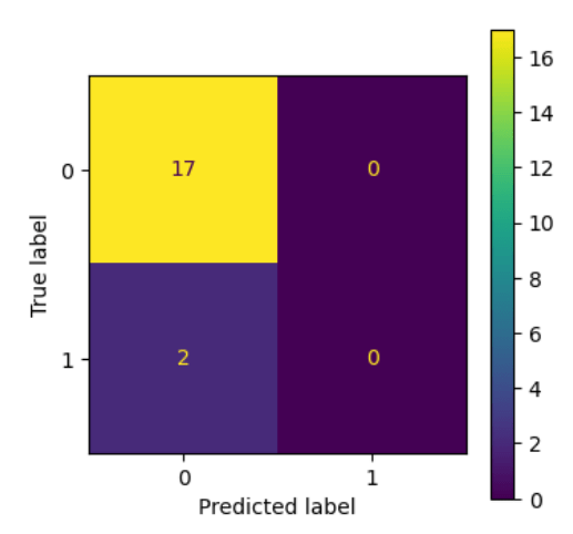
Confusion Matrix
A confusion matrix is a graphical representation of how accurate a classifier is at predicting the labels for a categorical variable.
# Split data into training and holdout samples
X_train, X_test, y_train, y_test = train_test_split(X, y, test_size=0.3, random_state=42)
# Build regression model
clf = LogisticRegression().fit(X_train,y_train)
# Save predictions
y_pred = clf.predict(X_test)
In order to understand and interpret the numbers in the below confusion matrix, it is important to keep the following in mind:
- The upper-left quadrant displays the number of true negatives.
- The bottom-left quadrant displays the number of false negatives.
- The upper-right quadrant displays the number of false positives.
- The bottom-right quadrant displays the number of true positives.
We can define the above bolded terms as follows in our given context:
- True negatives: The number of people that did not have arthritis that the model accurately predicted did not have arthritis.
- False negatives: The number of people that did not have arthritis that the model inaccurately predicted did not have arthritis.
- False positives: The number of people that had arthritis that the model inaccurately predicted not having arthritis.
- True positives: The number of people that had arthritis that the model accurately predicted as having arthritis.
A perfect model would yield all true negatives and true positives, and no false negatives or false positives.
# Calculate the values for each quadrant in the confusion matrix
cm = metrics.confusion_matrix(y_test, y_pred, labels = clf.classes_)
# Create the confusion matrix as a visualization
disp = metrics.ConfusionMatrixDisplay(confusion_matrix = cm,display_labels = clf.classes_)
# Display the confusion matrix
fig, ax = plt.subplots(figsize=(4,4))
disp.plot(ax=ax)