Dates can be a bit tricky. For the best solution to working with dates in our Pivot Table example here, scroll down to the section called The Data Model – A Better Way. This better way involves Power Pivot and the Data Model.
Let’s consider the example of a table of sales data. We have a table of orders. The columns are Order Date, Order Id, Salesperson and the Total Dollar Amount of the sales. We are keenly interested in the dates. Some days there are no sales and other days there is one or many sales.
Aside: Here’s a tip. You can enter today’s date with Ctrl+;. That’s the Control key held down, then the semicolon key. Below is our table. It has data for January, February, and March of 2022. Sales were made on most days, but not all days.

The Pivot Table Default
When I create the Pivot table and bring in Amount and the Orderdate, I get something like the following.
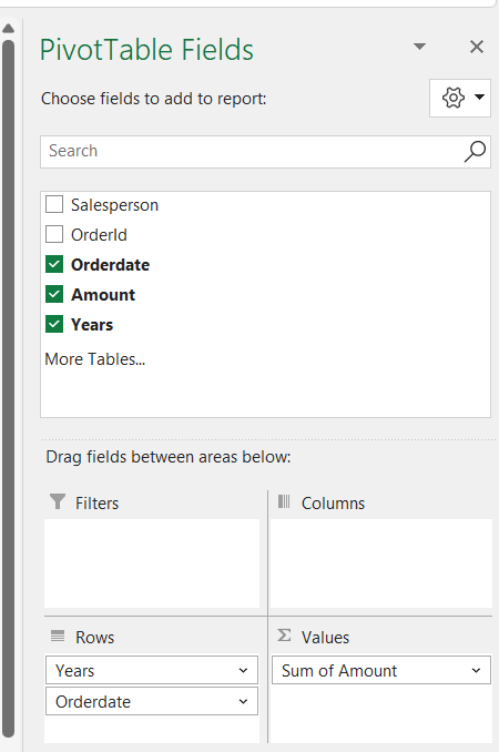
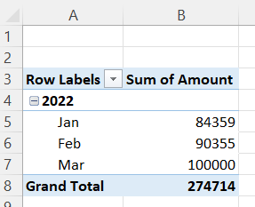
The Pivot table looks something like this.
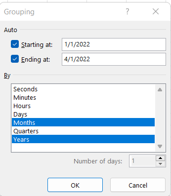
If this is fine for you and its all you’ll need from this data, then you can leave it as is and perhaps create a chart to go with it and carry on. However, there is a better, more flexible way. Also know that you can re-group the dates by selecting a month (as Feb is selected in the diagram) and right-click and choose Group or Ungroup. This may work fine for you. If you choose Group… you get the following dialog box.
This may work for you, but there is a better way.
The Data Model – A Better Way
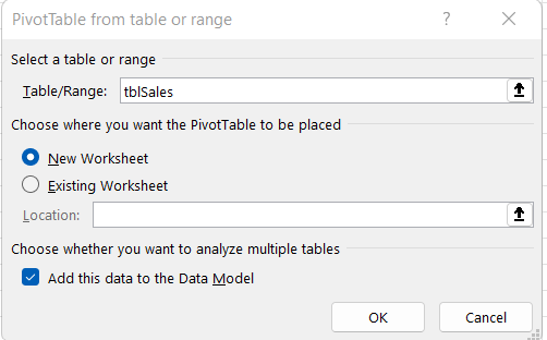
Let’s start again. Let’s create a Pivot table using the Data Model.

If your Excel version’s menu system does not look like the above screenshot when you click on the down arrow, then click on From Table/Range to see the diagram below. Be sure to check the check box at the bottom.
Depending on your Excel version, a new Calendar table will or will not be automatically added. In my version of Excel, a Calendar was automatically added. If the calendar was not automatically added check out a YouTube video.
Have a look at this YouTube video called Properly Handling Date Grouping in Excel Pivot Tables (Change Grouping, Get All dates) by Leila Gharani. Look at time 4:18 in the video.
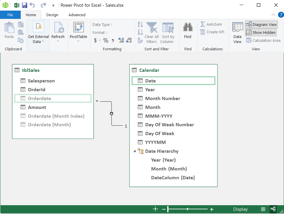
Add a Calendar Table in Power Pivot
To add a calendar table in the Power Pivot window, click on the Design tab, Date Table, New.

Below is a screenshot of the Excel Power Pivot Calendar. Notice that on the left column you get all the days listed. In our original data set, we did not have any sales on January 3, 2022. This will be important to you if you want to graph the sales and be able to show days with no sales along side days with sales.

Create a Relationship
We need to create a relationship between our new Calendar table and our data if it has not already been created. In my Excel version (Microsoft 365 in the autumn of 2022), the relationship was already created, as shown in the below screenshot. There is a link between the two tables. To create this link, have a look at the YouTube video at time 6:24. You would click on the Calendar’s Date and drag it to your table’s date.
One more thing to do, as discussed at time 6:50 in the video., depending on your version of Excel. You can hide your date in your table from the client tolls so that you don’t mistakingly use that date instead of the dates in the new calendar table.

To go back to Excel, just click on the Excel icon in the top left corner of the Power Pivot for Excel window. Now in our Pivot tables we have the dates of the new Calendar available to work with.

Even Better
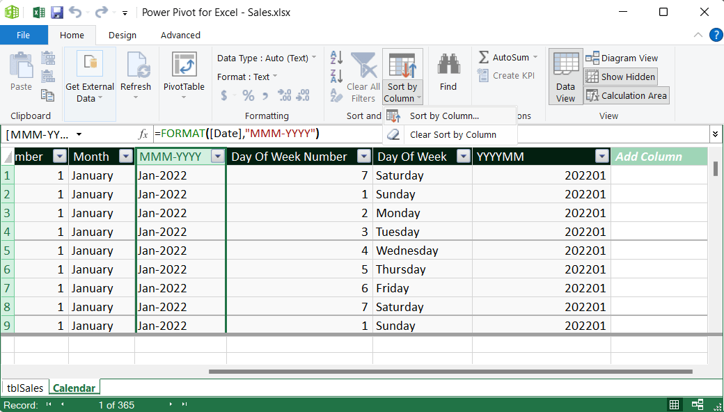
Let’s make our Dates even better. Go back to the data model and open the calendar table. We need to add a helper column in our table. Why? We need to be able to sort a column by another column. Yes, that’s right, we sort one column by another column. In the video, have a look starting at time 8:00. We need to sort the MMM-YYYY column by a column that has the year and date sorted chronolgically, not alphabetically. Click inside that last column on the right that’s called Add Column. Add an equals sign. Let’s create some data that we can easily sort properly. If January 2022 is 202201 and February 2022 is 202202 and so on, we could use this column to sort. Click on a data element in the Year column, type the asterisk, then 100, then a plus sign, then the Month Number, and press enter. Renamer the column YYYYMM.

Go back to and select the MMM-YYYY columns and click on Sort By Column. When the dialog box pops up you can select the new column to sort by, which is YYYYMM.
Show items with no data on rows
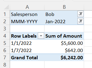
Let’s re-work our pivot table. Let’s filter by the Salesperson and the month. For the month we’ll use MMM-YYYY. It will be properly sorted in chronological order. By default, we only get the dates where the Salesperson had sales for the month we filtered on. Let’s pick Bob in January 2022. Below are two screenshot of our pivot table and setup.

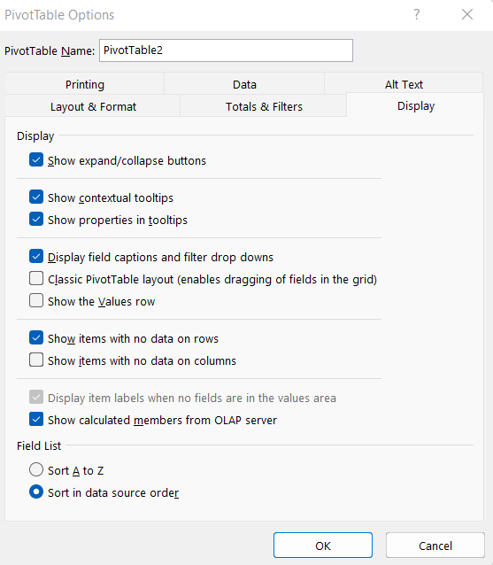
To view all of the dates in January, click on a date in the pivot table. Right-click and select the Display tab and check the check box for how items with no data on rows, and click ok.
Now look at the pivot table.

Quarters
We might want to present our dates based on quarters. We don’t have that yet in our Calendar table. Go to Powerr Pivot. Go to the Calendar table. Click on the tab in the bottom left corner. In the Add Column column, type Quarters for a column name. Type the equals sign and add the formula.
Here is the formula for our new column called Quarters: =INT((‘Calendar'[Month Number]+2)/3). The INT() function rounds down to the nearest whole number.
We should have Quarters available in our Pivot Table. We could make it a filter, for example.
Adding More Dates
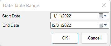
Suppose we need to update the date range of our Calendar table. Perhaps we have added more data that goes beyond the range of our Calendar. How do we do this? Go to the Power Pivot window, the Diagram View. Click on the Calendar table and click on the Design menu at the top.

You can manually set your date range.
Below is our pivot chart. It’s filtered for only January 2022. It is for all salespeople. It shows all days in January, even if we had no sales on a particular day. That’s a much better representation of the data than just skipping over and not showing a bar when we had no sales on a particular day. Here, with the Calendar, we are showing all of the dates, not just the dates with sales.
