Excel has the ability to create a chart that is a geographic map showing your data.
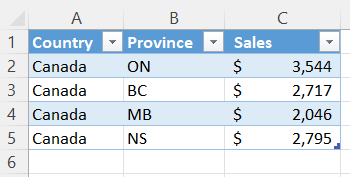
As a very simple example, I have created some random data and converted the data into an Excel table with the shortcut Ctrl+T. This is a table, not a pivot table. Below is a screenshot of the data. I used the Excel function RANDBETWEEN(1000,4000) to generate the sales data and then I selected and copied the column and pasted the values. The data is shown below.
Click on a cell inside the table. Go to the Insert tab (menu). In the Charts group click on Maps.

Your chart will look something like the chart below.

Formatting the Map
I have not yet done any formatting to the map. If I double-click in the chart’s white space (perhaps just to the right of the title) I open up the dialog box on the right of the screen where I can set my options.

I changed to border to a solid line and increased the width of the border to 1.5 points.
If I double-click the map itself I reveal the Format Data Series options. I have chosen to Show All Map Labels.

I have changed the colors to green and got the following results in my map. Also, I added data labels.

Here below is a screenshot of the results.
