The Tooltip is one of the three content containers that don’t have the notion of being clicked. The other two are the Label and the Frame.
The ToolTip control holds its content in a floating box that appears when you hover over an associated control and disappears when you move the mouse away. A WPF ToolTip can hold anything you want. This is because the ToolTip is not a string type, but instead an object type, meaning that we can put whatever we want in there. However, even though a ToolTip can contain interactive controls such as Buttons, those controls never get the focus and you can’t click on them or otherwise interact with them.
Below is the XAML code of a very simple example. Here we are just setting the ToolTip property of the Button.
<Button ToolTip="Click this button" Height="25" Width="80">Click me</Button>
Microsoft Office-style ScreenTip
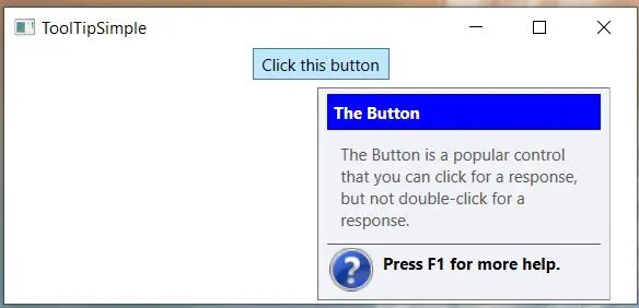
Below is a screenshot of our more advanced ToolTip, thanks to Microsoft and Adam Nathan of the book WPF 4.5 Unleashed published by Sams on pages 250-251. This is an older version. You might find that they no longer use the blue background and it says “Tell me more” instead of “Press F1 for more help.
Here is the XAML.
    <StackPanel>
        <Button Height="23" Width="100" Content="Click this button">
            <Button.ToolTip>
                <StackPanel>
                    <Label FontWeight="Bold" Background="Blue" Foreground="White">
                        The Button
                    </Label>
                    <TextBlock Padding="10" TextWrapping="WrapWithOverflow" Width="200">
                         The Button is a popular control that you can click for a response,
                        but not double-click for a response.
                    </TextBlock>
                    <Line Stroke="Black" StrokeThickness="1" X2="200"/>
                    <StackPanel Orientation="Horizontal">
                        <Image Margin="2" Source="help.png"/>
                        <Label FontWeight="Bold">Press F1 for more help.</Label>
                    </StackPanel>
                </StackPanel>
            </Button.ToolTip>
        </Button>
    </StackPanel>