The TabControl is a type of selector control in WPF that is useful for switching between multiple pages of content. Tabs are normally places at the top but with TabControl’s TabStripPlacement property you can also set their placement to Left, Right or Bottom.
Tab Content
The TabItem element comes from the ContentControl class, which means that you may define a single element inside of it that will be shown if the tab is active. If you want to place more than one control inside of the tab, just use one of the panels with child controls inside of it.
Tab Headers
The tab headers can also contain anything you like, just like the content of the tabs can.
Basic Examples
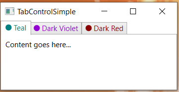
Below is the XAML code for the most basic example of the TabControl. There are three TabItems. The code below the most basic code illustrates how the Headers can have more than one control in them. In our example, we have an Ellipse and a TextBlock that exist inside a horizontal StackPanel. To be able to do this, we need to use TabItem.Header.
        <TabControl>
            <TabItem Header="Part 1">Content 1</TabItem>
            <TabItem Header="Part 2">Content 2</TabItem>
            <TabItem Header="Part 3">Content 3</TabItem>
        </TabControl>
Below is the screenshot and full XAML code for our second basic example with
Below is the XAML code.
<Window x:Class="TabControlSimple.MainWindow"
        xmlns="http://schemas.microsoft.com/winfx/2006/xaml/presentation"
        xmlns:x="http://schemas.microsoft.com/winfx/2006/xaml"
        xmlns:d="http://schemas.microsoft.com/expression/blend/2008"
        xmlns:mc="http://schemas.openxmlformats.org/markup-compatibility/2006"
        xmlns:local="clr-namespace:TabControlSimple"
        mc:Ignorable="d"
        WindowStartupLocation="CenterScreen"
        Title="TabControlSimple" Height="250" Width="400">
    <Grid>
        <TabControl>
            <TabItem>
                <TabItem.Header>
                    <StackPanel Orientation="Horizontal">
                        <Ellipse Height="10" Width="10" Fill="Teal"/>
                        <TextBlock Text=" Teal" Foreground="Teal" />
                    </StackPanel>
                </TabItem.Header>
                <Label Content="Content goes here..." />
            </TabItem>
            <TabItem>
                <TabItem.Header>
                    <StackPanel Orientation="Horizontal">
                        <Ellipse Height="10" Width="10" Fill="DarkViolet"/>
                        <TextBlock Text=" Dark Violet" Foreground="DarkViolet" />
                    </StackPanel>
                </TabItem.Header>
            </TabItem>
            <TabItem>
                <TabItem.Header>
                    <StackPanel Orientation="Horizontal">
                        <Ellipse Height="10" Width="10" Fill="DarkRed"/>
                        <TextBlock Text=" Dark Red" Foreground="DarkRed" />
                    </StackPanel>
                </TabItem.Header>
            </TabItem>
        </TabControl>
    </Grid>
</Window>