A CheckBox is a familiar control to even the casual computer user. CheckBox is a simple class in WPF that derives from ToggleButton. CheckBoxes have the concept of being clicked by a mouse and keyboard. It also retains a state of being checked or not checked. It also has a three-state mode: checked, unchecked and indeterminate.
Below is a screenshot of a very simple example, and below that is the XAML code used.
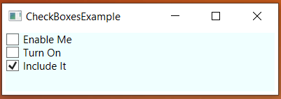
Notice that the third one is checked when the program opens.
<Window x:Class="CheckBoxesExample.MainWindow"
        xmlns="http://schemas.microsoft.com/winfx/2006/xaml/presentation"
        xmlns:x="http://schemas.microsoft.com/winfx/2006/xaml"
        xmlns:d="http://schemas.microsoft.com/expression/blend/2008"
        xmlns:mc="http://schemas.openxmlformats.org/markup-compatibility/2006"
        xmlns:local="clr-namespace:CheckBoxesExample"
        mc:Ignorable="d"
        WindowStartupLocation="CenterScreen"
        Title="CheckBoxesExample" Height="250" Width="400">
    <StackPanel Margin="4" Background="Azure">
        <CheckBox>Enable Me</CheckBox>
        <CheckBox>Turn On</CheckBox>
        <CheckBox IsChecked="True">Include It</CheckBox>
    </StackPanel>
</Window>
Custom Content
You don’t have to just settle for text beside the check box. The CheckBox control inherits from the ContentControl class. What does this mean? CheckBox can take custom content and display it. However, if you just specify a piece of text, as in the above example, WPF will put it inside a TextBlock control and display it, for your convenience. Here is what that looks like.
<CheckBox><TextBlock>Enable Me</TextBlock></CheckBox>