You can style all of your buttons in your WPF project with code only in one place, instead of repeating the same code for each button. This example styles all of your buttons on a project-wide basis. This sounds a bit like styles of cascading style sheets. How do you do this in WPF? You can use the App.xaml file that comes included in your project.
This post’s information is loosely based on code from a book by Adam Nathan called WPF 4.5 Unleashed.
Below is the code in the App.xaml file when you first create your project, except that the YOUPROJECTNAMEHERE is replaced with the name of your project. The App.xaml is given to you by Visual Studio when you create your project.
<Application x:Class="YOUPROJECTNAMEHERE.App"
             xmlns="http://schemas.microsoft.com/winfx/2006/xaml/presentation"
             xmlns:x="http://schemas.microsoft.com/winfx/2006/xaml"
             xmlns:local="clr-namespace:DockMenuStackGrid"
             StartupUri="MainWindow.xaml">
    <Application.Resources>

    </Application.Resources>
</Application>
Below is some code I wrote in the App.xaml file. We have set two properties to be applied to all of the buttons in our project.
    <Application.Resources>
        <Style TargetType="Button">
            <Setter Property="MinHeight" Value="23" />
            <Setter Property="Margin" Value="3" />
        </Style>
    </Application.Resources>
Here below is a partial listing of the XAML code in our MainWindow.xaml file. A simple StackPanel with three Buttons. In the App.xaml file above, the target type is Button as you can see from the code: TargetType=”Button”. If the TargetType were something else, such as “Label”, our three buttons would not take on the two property values. If you remove the code “TargetType=”Button” from the Style in the App.xaml file, you get an error. The member MinHeight and member Margin is not recognized or not accessible.
    <StackPanel>
        <Button Content="1"/>
        <Button Content="2"/>
        <Button Content="3"/>
    </StackPanel>
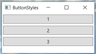
Below is the screenshot of the running program where our three buttons take on the two styles in our App.xaml file.
Override
Below is the code that changes our program a bit by overriding the margin of the second button. In the screenshot above, we did not use the code Margin=”10″. This is a good way to work because we can set the properties of all of our application’s buttons to a specific style and then still override individual buttons as we see fit. Our code has less duplication and is much easier to maintain. The local value (Margin=”10″) trumps anything from the style. Also, note that you don’t need to worry about a Style being applied to n element that doesn’t have all the listed dependency properties. The properties that exist are set and the one’s that don’t exist are ignored.
    <StackPanel>
        <Button Content="1"/>
        <Button Content="2" Margin="10"/> <!-- Override Margin -->
        <Button Content="3"/>
    </StackPanel>
Below is the screenshot for the above code.

Consolidating Property Assignments Inside a Style
Instead of using the App.xaml file as in the first example above, we could create a style right in our XAML file, as shown below. It sets the minimum height of a button to 23 and sets the margin to 3. It produces exactly the same results as the first screenshot above in this article. Because of this I will not repeat the screenshot here.
    <StackPanel>
        <StackPanel.Resources>
            <Style x:Key="myButtonStyle">
                <Setter Property="Button.MinHeight" Value="23"/>
                <Setter Property="Button.Margin" Value="3"/>
            </Style>
        </StackPanel.Resources>
        <Button Content="1" Style="{StaticResource myButtonStyle}"/>
        <Button Content="2" Style="{StaticResource myButtonStyle}"/>
        <Button Content="3" Style="{StaticResource myButtonStyle}"/>
    </StackPanel>