
Histogram of Categorical Data
Are you are a data professional who is interested in generating a histogram in Python? Suppose you are […]
Are you are a data professional who is interested in generating a histogram in Python? Suppose you are […]

The bar chart is one of the most common and most important charts. I will loosely follow Corey […]

Let’s create a very simple pie chart using the Python library matplotlib. There is however some controversy with […]

Do you want to become more familiar with producing histograms in the matplotlib library of Python? I created […]

How do you take a pandas DataFrame of data (dataset) and produce a multi-column bar chart? You can […]

Matplotlib is a library in Python language. In order to write this blog post I created a new […]
Exploratory Data Analysis (EDA) has six main practices. The six main practices of EDA are discovering, structuring, cleaning, […]
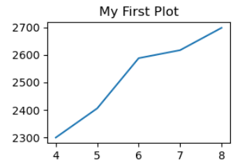
Matplotlib is a low level graph plotting library in python that serves as a visualization utility. Matplotlib was […]
Communicating your work is an important step in your work as an analyst. There are other methods for […]
We can use the ggplot2 facet functions to display our data in new ways. Facet functions let you […]
The ggplot2 package lets you make high-quality, customizable plots of your data. ggplot2 is based on the grammar […]
The McCandless method of data visualization and presentation is a set of guidelines for presentations by David McCandless. […]