Let’s talk about a very simple scatterplot using the Python library matplotlib and pandas. To create a scatter plot using Matplotlib, you’ll use the plt.scatter() function.
The general syntax is as follows. You would supply the x and y values. You could use a column of a pandas DataFrame for the x values, and another column for the y values.
import matplotlib.pyplot as plt
plt.scatter(x_values, y_values)
You can customize your plot.
- Marker Size (s): Specify the marker size in points squared (typographic points are 1/72 inch). The default size is determined by rcParams[‘lines.markersize’] squared.
- Marker Color (c): Choose the marker colors. You can provide a scalar or sequence of numbers to be mapped to colors using a colormap.
- Marker Style (marker): Set the marker style (e.g., ‘o’ for circles, ‘s’ for squares, etc.).
- Colormap (cmap): Define the colormap used to map scalar data to colors.
- Normalization (norm): Scale scalar data to the [0, 1] range before mapping to colors using the colormap.
- Alpha (alpha): Adjust the transparency of markers.
- Edge Color (edgecolors): Control the color of marker
Palmer Penguins
I will do a simple scatterplot with the Palmer Penguins dataset.
# Import packages
import pandas as pd
import matplotlib.pyplot as plt
import seaborn as sns
# Load dataset
df = sns.load_dataset("penguins")
# Examine first 5 rows of dataset
df.head()
plt.figure(figsize =(4, 4))  # width and height of graph
plt.scatter(df['flipper_length_mm'], df['body_mass_g'], alpha=0.4)
plt.title('Palmer Penguins')
plt.xlabel('flipper length (mm)')
plt.ylabel('body mass (g)')
plt.show()
Here below is a screenshot of the chart in Jupyter Notebook that I created and named Scatterplot of Palmer Penguins in Matplotlib.
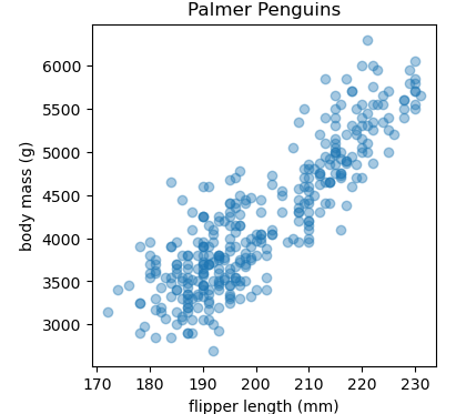
There is clearly a correlation between our two variables. The longer the flipper length, the more body mass. Also note that the alpha setting of 0.4 is helpful to see the dots when thewy overlap. As a further comment, there almost seems to be two clusters.
Learn with YouTube
Matplotlib Tutorial (Part 7): Scatter Plots by Corey Schafer.