What is Anscombe’s Quartet? It has four datasets with nearly identical summary statistics. It underscores the limitations of relying solely on numerical metrics and statistics and emphasizes the importance of creating charts to observe the data. The datasets were created by the statistician Francis Anscombe in 1973 to demonstrate the importance of visualizing data and to show that summary statistics alone can be misleading.
Anscombe’s quartet is used to illustrate the importance of exploratory data analysis (EDA) and the drawbacks of depending only on summary statistics. It also emphasizes the importance of using data visualization to spot trends, outliers, and other crucial details that might not be obvious from summary statistics alone. The quartet is still often used to illustrate the importance of looking at a set of data graphically before starting to analyze according to a particular type of relationship, and the inadequacy of basic statistic properties for describing realistic datasets.
It’s a very simple data set at first glance. All of the x values are identical, x1, x2, x3 and x4. All of the y values have the changes depending on whether it’s in y1, y2,y3 or y4. Now the crucial thing is that the summary statistics, the average, the variance, the correlation and the linear regression slope are all identical. So the mean of x1, x2, x3 and x4 are all 9. The means of y1, y2, y3, and y4 are all 7.5. And similarly, the variance of x are all identical, and the variances of ys are all identical. The correlations of each of those x1 and y1, x2, y2, x3, y3, x4, and y4 are all identical, which means it is exactly the same regression line for each of the equations.
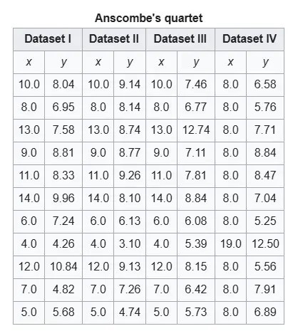
To plot Anscombe’s Quartet in Tableau, the data visualization software, we’ll want to format the data as ‘long” data where each point in a single row. We will be plotting four separate graphs so we have a column to identify each of the four graphs with a label that is called Set. Below is a screenshot of the original dataset provided by Anscombe.
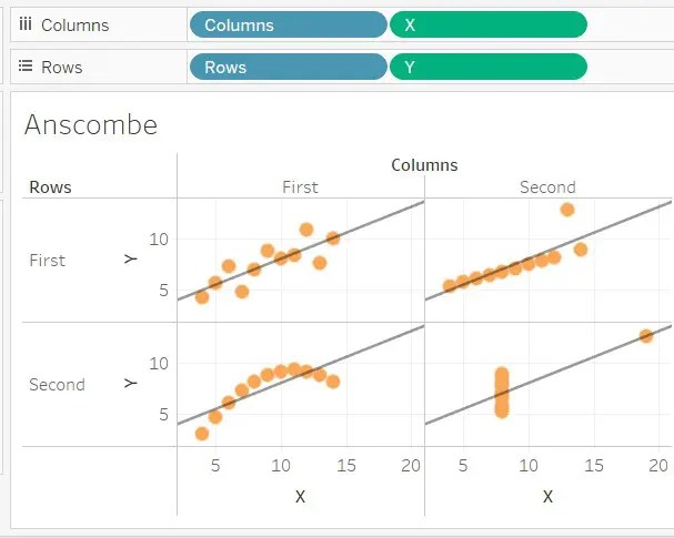
In Tableau, this below is what it looks like.
In order to get this to work in Tableau, we need to normalize the data. Each row will have one observation. Currently the data has four observations for each row. We need the data to be in a “tall” format, not a ‘wide” format. Here is the Excel file that has been normalized.
One really neat trick you can do here is to paste the data from Excel into Tableau. Copy all of the rows and columns (including the column headers) and paste it into Tableau. No importing necessary with this small (or even medium) sized dataset.
You can see how it looks in Tableau from the above screenshot. You will need to change the X and the Y to a dimension after you drag those pills over. It’s now starting to look like the final product. We need to do some formatting. Change the Marks from Automatic to a circle with the drop-down. Click on the Color mark and choose orange. Click the Size mark and adjust it up a small amount. Now we can add a trend line. Near the top left of the Tableau interface, click Analytics. Drag Trend line over to the diagram. Remove the confidence interval lines as they are not needed.
Thanks. I put your link in my David McCandless post because he did a visualization on the best and most popular dogs, and the Pomeranian rates very well.