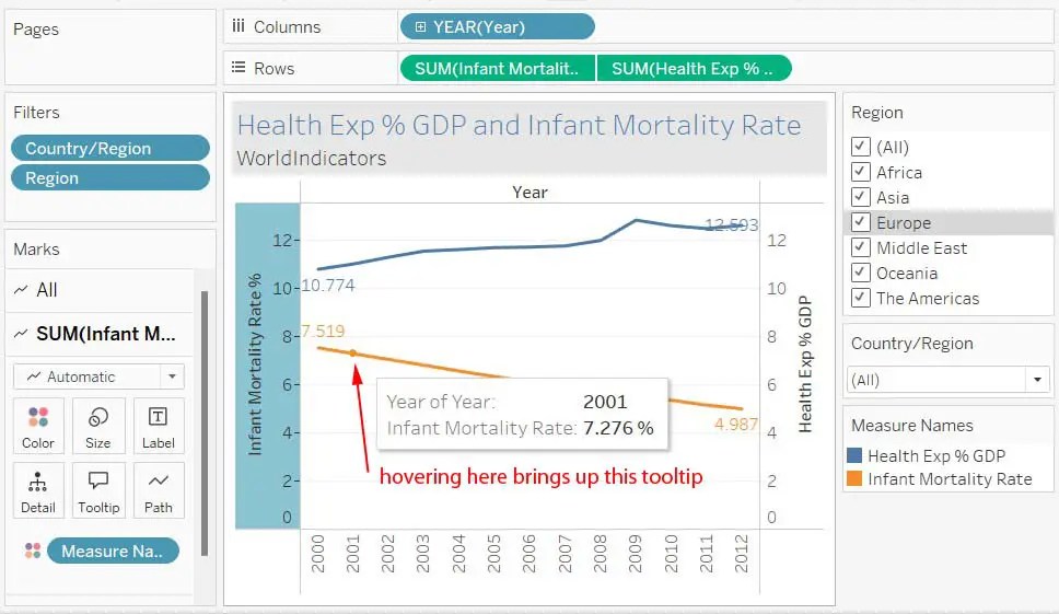
Here is an example of a line chart using Tableau’s World Indicators dataset. World Indicators come packaged with Tableau. You are wondering about the relationship between infant mortality and a country’s health expenditure as a percentage of GDP. Later, you might want to do that same analysis with health expenditure per capita. Click the screen shot below to enlarge it. I have added some comments in red. In Tableau, I set it to Fit Width instead of Standard in the top axis.
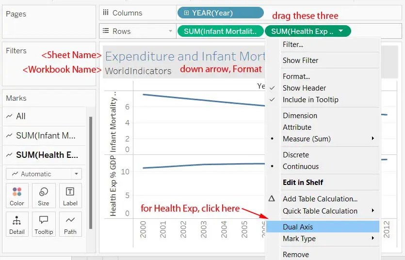
After dragging the three pills, you will have two graphs, one on top of the other. Make it dual axis. Also, select synchronize axis, but we can do this later. Click on Label in the Marks card and click on the check box for Show mark labels. Click the Font down arrow to make changes. Click Label and click the Line Ends button. Do that for each of the fields.
Drag the Country and Region to the Filters. Choose show all. Click the pill’s down arrow and select Show filter. At the right-hand side we could click the down arrow and set it to Single Value (dropdown) for both, or at least for the Country. For the Country filter on the right side of the screen, set it to Only Relevant Values.
We next need to synchronize the axes. Right-click the right axis and choose Synchronize Axis. You can edit the tooltip by adding a % sign, as I’ve done here.