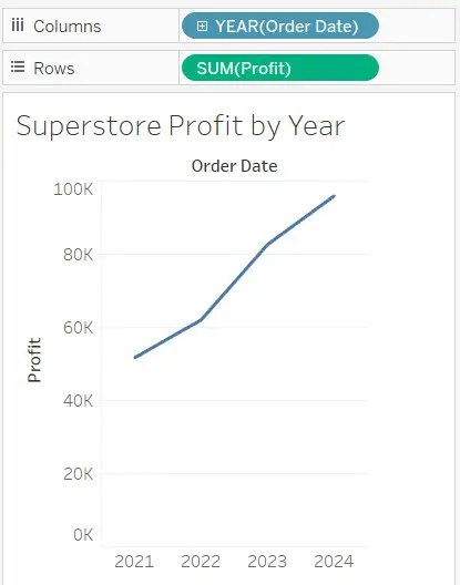
Line charts (graphs) are one of the more important and useful charts in Tableau. They are used to represent the passage of time.
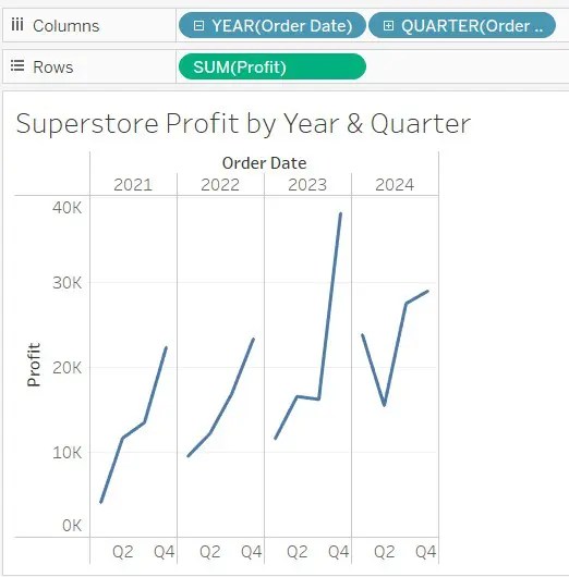
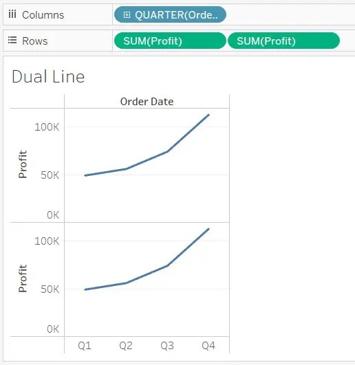
Recall that blue pills are discrete. Here is another example. When you have multiple discrete fields on either Rows or Columns, Tableau creates sections, which are called panes.
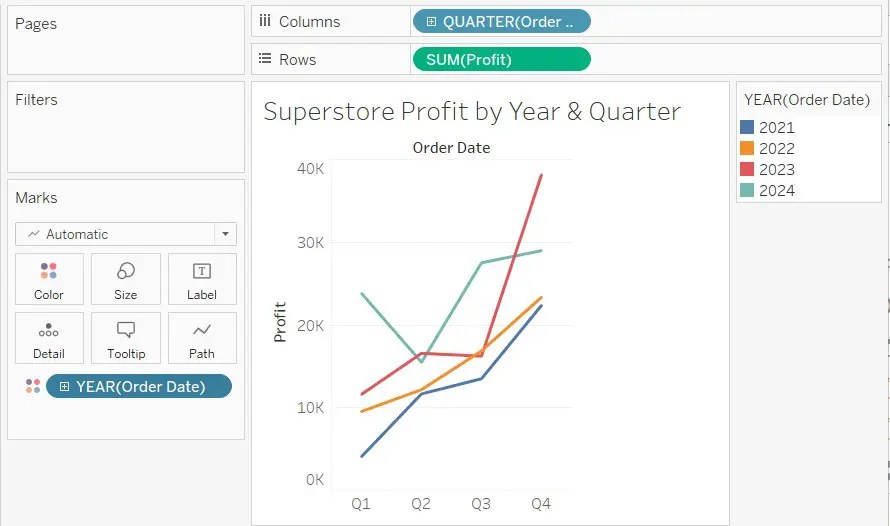
If we move the YEAR(Order Date) discrete pill from Columns to Color on the Marks card, we can better compare the values, particularly the fourth quarter of each.
Seasonal trends are easy to identify with these discrete line charts. Continuous line charts are useful for seeing the full range over time.
Dual Line Charts (Dual Axis)
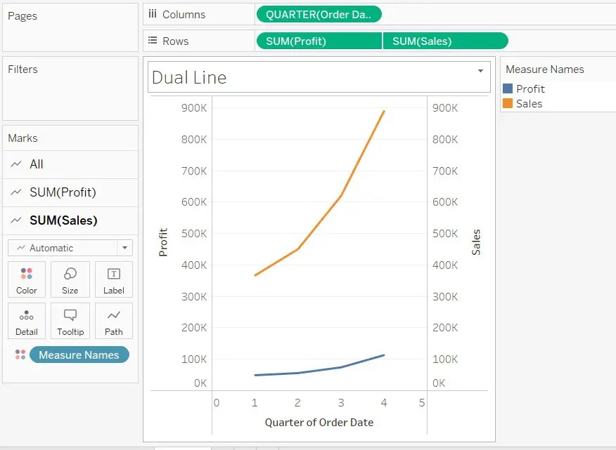
A dual line chart is also referred to as a dual axis chart. It is an extension of the line chart with one notable exception. It allows more than one measure to be represented with two different access ranges. This is done by signing the right and left sides of the vertical access with different measures. In this way, you can compare two different measures. Suppose you want to compare sales and profits over time.
Drag our Order Date to the Columns bar. Then, let’s change the date to show quarters instead of years. You do this by clicking on the arrow on the Order Date field then choosing Quarter.
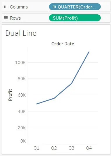
Let’s drag our Profit measure on to the Row bar. Now we are able to see profit for each quarter since 2011.
How do we convert this to a dual axis? Let’s click on our Show Me charts options. Let’s click on the dual line chart. Now our charts are combined, and we can see the left vertical axis shows us profit, while the right vertical axis shows us sales.
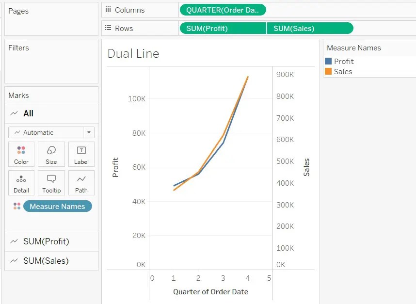
You can see that the left and right axes are not synchronized. The charts are combined, but not synchronized. We have Profit on the left and Sales on the right. We can do this by right-clicking on the right vertical axis and choosing Synchronize Axis.