- EDA Structuring with Pandas
- Data Type Conversion in pandas
- Groupby Multiple Columns
How do you take a pandas DataFrame of data (dataset) and produce a multi-column bar chart? You can manipulate the DataFrame with groupby first to aggregate the data. Then you can use matplotlib and seaborn to plot the data.
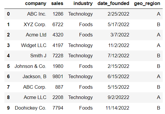
To do this we’ll work with an example. We have a list of companies that belong to two different industries and two different regions. Here I create a DataFrame manually and call it df. When we group the data, we’ll create a new DataFrame and call it df_2. We’ll use that DataFrame to plot the two bar charts.
import pandas as pd
data = {'company': ['ABC Inc.', 'XYZ Corp.', 'Acme Ltd', 'Widget LLC', 'Smith J', 'Johnson & Co.', 'Jackson, B',
                    'ABC Corp.', 'Acme LLC', 'Doohickey Co.'],
       'sales': [1286, 6722, 4320, 4197, 7228, 1980, 9801, 887, 2208, 7794],
       'industry': ['Technology', 'Foods', 'Foods', 'Technology', 'Technology', 'Foods', 'Technology', 'Foods',
                   'Technology', 'Foods'],
       'date_founded': ['2/25/2022', '5/17/2022', '3/7/2022', '11/2/2022', '7/12/2022', '2/15/2022', '6/15/2022',
                        '5/15/2022', '9/2/20222', '11/14/2022'],
       'geo_region': ['A', 'B', 'A', 'A', 'B', 'B', 'A', 'B', 'A', 'B']}
df = pd.DataFrame(data)
df
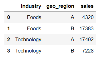
Groupby Two Columns and Sum Another Column
# Groupby industry and geo_region, and sum the sales column
df_2 = df.groupby(['industry','geo_region'])['sales'].sum().reset_index()
df_2
# in the above code, ['geo_region', 'industry'] would also work fine.
import matplotlib.pyplot as plt
import seaborn as sns
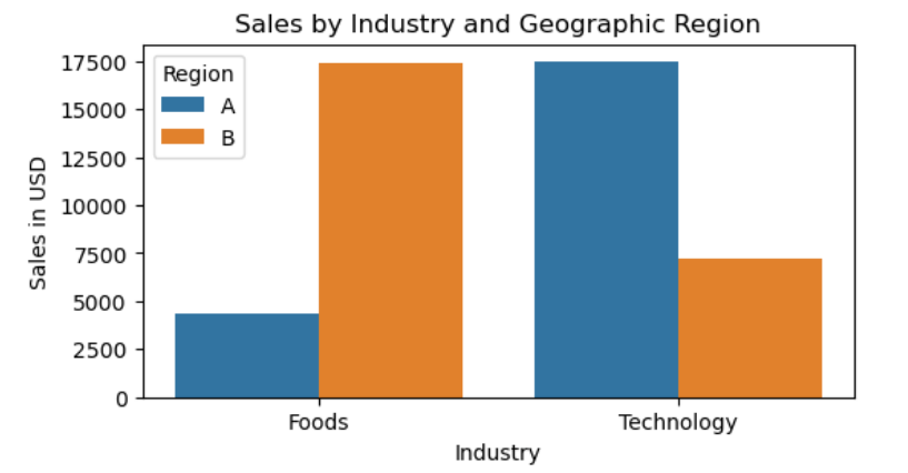
plt.figure(figsize=(6,3))
sns.barplot(x=df_2['industry'],
y=df_2['sales'],
hue=df_2['geo_region'])
plt.title('Sales by Industry and Geographic Region')
plt.xlabel('Industry')
plt.ylabel('Sales in USD')
plt.legend(title='Region',loc='upper left')
plt.plot()
plt.show()
Once you have the DataFrame (df2) prepared, you can build two types of graphs. Below is the second one. Notice that we’ve switched the legend and the x-axis.
plt.figure(figsize=(7,3))
sns.barplot(x=df_2['geo_region'],
           y=df_2['sales'],
           hue=df_2['industry'])
plt.title('Sales by Geographic Region and Industry')
plt.xlabel('Region')
plt.ylabel('Sales in USD')
plt.legend(title='Industry',loc='upper left')
plt.plot()
plt.show()

Warning
Here is an article called pandas groupby warning.