WPF Tutorial says in their article A simple TreeView example: “The Header is an interesting property, though. As you can see, I can just specify a text string and then have it rendered directly without doing anything else, but this is WPF being nice to us – internally, it wraps the text inside of a TextBlock control, instead of forcing you to do it. This shows us that we can stuff pretty much whatever we want to into the Header property instead of just a string and then have the TreeView render it – a great example of why it’s so easy to customize the look of WPF controls.”
Inside the TreeViewItem.Header is a StackPanel with an Ellispe and a TextBlock. We set the Orientation of the StackPanel to Horizontal because the default is Vertical.
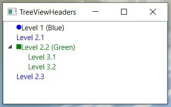
<Window x:Class="TreeViewHeaders.MainWindow"
        xmlns="http://schemas.microsoft.com/winfx/2006/xaml/presentation"
        xmlns:x="http://schemas.microsoft.com/winfx/2006/xaml"
        xmlns:d="http://schemas.microsoft.com/expression/blend/2008"
        xmlns:mc="http://schemas.openxmlformats.org/markup-compatibility/2006"
        xmlns:local="clr-namespace:TreeViewHeaders"
        mc:Ignorable="d"
        WindowStartupLocation="CenterScreen"
        Title="TreeViewHeaders" Height="250" Width="300">
    <Grid>
        <TreeView>
            <TreeViewItem IsExpanded="True">
                <TreeViewItem.Header >
                    <StackPanel Orientation="Horizontal">
                        <Ellipse Width="8" Height="8" Fill="Blue"/>
                        <TextBlock Text="Level 1 (Blue)" />
                    </StackPanel>
                </TreeViewItem.Header>
            </TreeViewItem>
            <TreeViewItem>
                <TreeViewItem.Header>
                    <StackPanel Orientation="Horizontal">
                        <TextBlock Text="Level 2.1" Foreground="Blue" />
                    </StackPanel>
                </TreeViewItem.Header>
            </TreeViewItem>
            <TreeViewItem IsExpanded="True">
                <TreeViewItem.Header>
                    <StackPanel Orientation="Horizontal">
                        <Rectangle Height ="8" Width="8" Fill="Green" />
                        <TextBlock Text="Level 2.2 (Green)" Foreground="Green" />
                    </StackPanel>
                </TreeViewItem.Header>
                <TreeViewItem>
                    <TreeViewItem.Header>
                        <TextBlock Text="Level 3.1" Foreground="Green" />
                    </TreeViewItem.Header>
                </TreeViewItem>
                <TreeViewItem>
                    <TreeViewItem.Header>
                        <TextBlock Text="Level 3.2" Foreground="Green" />
                    </TreeViewItem.Header>
                </TreeViewItem>
            </TreeViewItem>
            <TreeViewItem>
                <TreeViewItem.Header>
                    <TextBlock Text="Level 2.3" Foreground="Blue" />
                </TreeViewItem.Header>
            </TreeViewItem>
        </TreeView>
    </Grid>
</Window>