The Slider control in WPF is very much like the ProgressBar. There is a little more to it because the user is able to change the current value. The user moves the thumb through any number of optional ticks. The Slider has a default Minimum of 0 and a default Maximum of 10. There are several other properties you can work with: ToolTip, Delay, and Interval. If you are working in the code behind, you can use the SliderChanged event.
RGB Color Viewer
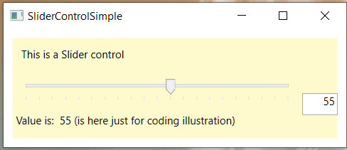
At this post we have a fairly simple example of a slider. For a more advanced and practical example, have a look at our post called WPF RGB Color Viewer. Below is the screenshot of this project.
All of this is achieved through XAML, with no code behind.
<Window x:Class="SliderControlSimple.MainWindow"
        xmlns="http://schemas.microsoft.com/winfx/2006/xaml/presentation"
        xmlns:x="http://schemas.microsoft.com/winfx/2006/xaml"
        xmlns:d="http://schemas.microsoft.com/expression/blend/2008"
        xmlns:mc="http://schemas.openxmlformats.org/markup-compatibility/2006"
        xmlns:local="clr-namespace:SliderControlSimple"
        mc:Ignorable="d"
        Title="SliderControlSimple" Height="170" Width="400">
    <DockPanel Margin="10" Background="LemonChiffon">
        <TextBlock DockPanel.Dock="Top" Margin="10">This is a Slider control</TextBlock>
        <TextBox Text="{Binding ElementName=sliderValue, Path=Value, UpdateSourceTrigger=PropertyChanged}"
                 DockPanel.Dock="Right" TextAlignment="Right" Width="40" Height="25"/>
        <Slider DockPanel.Dock="Top" Name="sliderValue" Margin="10" Maximum="100"
                TickPlacement="BottomRight" TickFrequency="5" IsSnapToTickEnabled="True"/>
        <WrapPanel DockPanel.Dock="Bottom" Margin="4">
            <TextBlock Text="Value is:  "></TextBlock>
            <TextBlock Text="{Binding ElementName=sliderValue, Path=Value, UpdateSourceTrigger=PropertyChanged}"
                   Width="Auto" Height="25"></TextBlock>
            <TextBlock Text=" (is here just for coding illustration)"></TextBlock>
        </WrapPanel>
    </DockPanel>
</Window>