- Scatterplots in Tableau
- Customer Sales Ranking in Tableau
- Customer Overview in Tableau
- Tableau Superstore Customer Dashboard
It’s time to build a dashboard in Tableau that’s based on three worksheets I’ve already built using the Sample Superstore dataset that comes with Tableau Desktop.
In Tableau, there is an interesting quirk. When you are building dashboards based on worksheets, you must have the filter you want already present in one of the worksheets before you can add the filter to the dashboard. This means that in our example, we’ll first go to the scatterplot worksheet (link is above) and add in a filter, if it’s not already there. It’s very easy to add a filter. Drag the appropriate pill to the Filters card. The pill is the Order Date.
Filters
Drag Order Date to Filters and select Years > Next > Use All > OK. It turns out that after some EDA, we know that we also want two more filters added: Category and Segment.
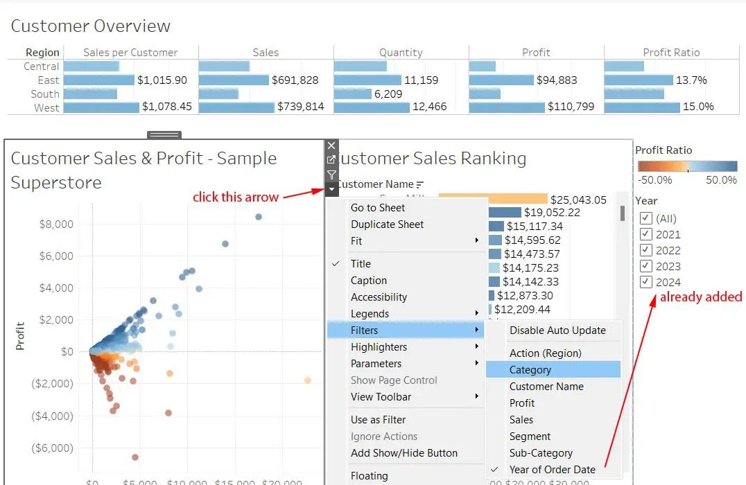
After adding all of our required filters to a worksheet, we go back to the dashboard and we need to bring them in one by one. After we have added the scatterplot worksheet to our dashboard by dragging it in, we can then add the filters.
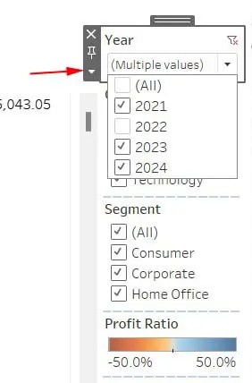
Adjust your filter for best appearance. Click the small down arrow and for the Year you can set it to Multiple Values (dropdown) to have it appear as it is in the screenshot below. You can also change the title of your filters by double-clicking the title and using the dialog box that popped up. You can change Year of Order Date to just Year, which will make more sense to the users.
Connect Your Filters
Right now, the year filter only works with the scatterplot. It’s not yet fully working. How do we get the filter to work with the other two charts? We need to tell Tableau that our Year filter applies to not just the scatterplot, but to the other two as well.
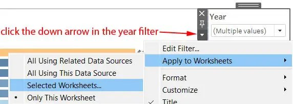
Click the down arrow on the Year filter, as shown above. A dialog box pops up and allows you to select the other two worksheets. Go ahead and select them. Do the same for the other filters as well.
Only Relevant Values
Our filters are not yet ready for production. We want to show the user only relevant choices based on the previously selected filters. Go to the Category filter and click on that small down arrow. Select Only Relevant Values should be checked. Do the same for Segment.
Actions
We will create three dashboard actions. Actions let you create interactive relationships between data, dashboard objects, other worksheets and the web.
We want the user to be able to hover over a specific customer in the customer ranking bar chart and then see that customer’s purchased graphed, or highlighted in the scatterplot. We know that one customer can have, and probably will have more than one purchase. How can we do that?
Action – Filter with Customer Overview
We also want the user to be able to go up to Customer Overview and click on one of the regions and impose a region filter on the other two (scatterplot and rank). Go to the main menu and click Dashboard, then click Actions. A dialog box pops up. Now select Add Action Filter. Another dialog box pops up. It is shown below in a screenshot.
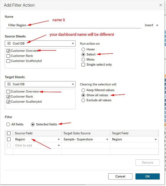
Now when the user clicks on one of the region’s bars in the Customer Overview section a filter is applied to the bottom two charts. Click again and the filter is removed.
Action – Highlight with Scatterplot and Rank
Add another action. We will add a Highlight action, not a filter. We’ll call it something that describes it, such as Highlight Customer. In the Add Highlight Action dialog box set the check boxes to Customer Rank and Customer Scatterplot. Run action on Hover.
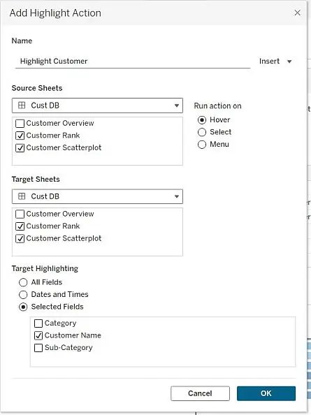
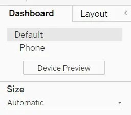
When the user hovers over the Customer Ranking for a particular customer, it works fine. The scatterplot shows all of the dots for that particular customer. However, it doesn’t really work the other way around. Now is a good time, if you haven’t already done so, to set the Size to Automatic.
Action Filter Lower
Add another action. Filter Lower. The source worksheet is Customer Scatterplot only. The action is on Select. The target sheet is Customer Rank. The Target Filter is the Customer Name again. Now when the user clicks on a dot in the scatterplot the customer ranking sheet will only show a bar for that particular customer. The bar is the total sales for that customer, but the dots in the scatterplot represent a single sale only.
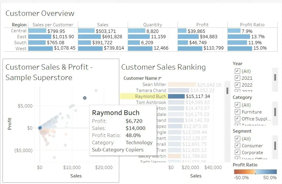
Here’s our final dashboard. The user has hovered over Raymond Buch in the scatterplot.