- Scatterplots in Tableau
- Customer Sales Ranking in Tableau
- Customer Overview in Tableau
- Tableau Superstore Customer Dashboard
If are wishing to compare two continuous variables in a dataset you could use a scatterplot. In Tableau, quantitative variables are called measures. Continuous measures appear as green pills. If we use the Sample Superstore dataset that comes with Tableau, we can drag Profit to Columns and Sales to Rows. We get a plot that only has a single dot. Why? Tableau automatically aggregates both values and the default is SUM. The sum of Profit is $292,297 and the sum of sales is $2,326,534.
We want to see a scatterplot, not just a single dot. We need to disaggregate. Go to the Analysis menu and uncheck Aggregate Measures. We need to drag Customer Name to the Detail marks card.
Click Shape on the Marks card. Select More Shapes. Click the down arrow and Filled. Click the OK button. Click Color in the Marks card and use the slider to reduce the Opacity to something that looks good, maybe 50%. You might want to reduce the Size of the circles as well. In the Marks card select Density from the drop down, instead of Automatic. Now it’s easier to see. I created a file called SuperstoreScatterSalesProfit.twb

Build it Again, but Better
Let’s build this again, but make it better. Drag Sales to the Columns shelf and drag Profit to the Rows shelf. We see only one dot because it has automatically been aggregated by Tableau. Let’s disaggregate the data. Click on the Analysis menu and then choose Aggregate Measures. Now we have a scatterplot, not just a single dot.
What does each dot represent? It represents a row in the dataset. Yes, because it is completely disaggregated.
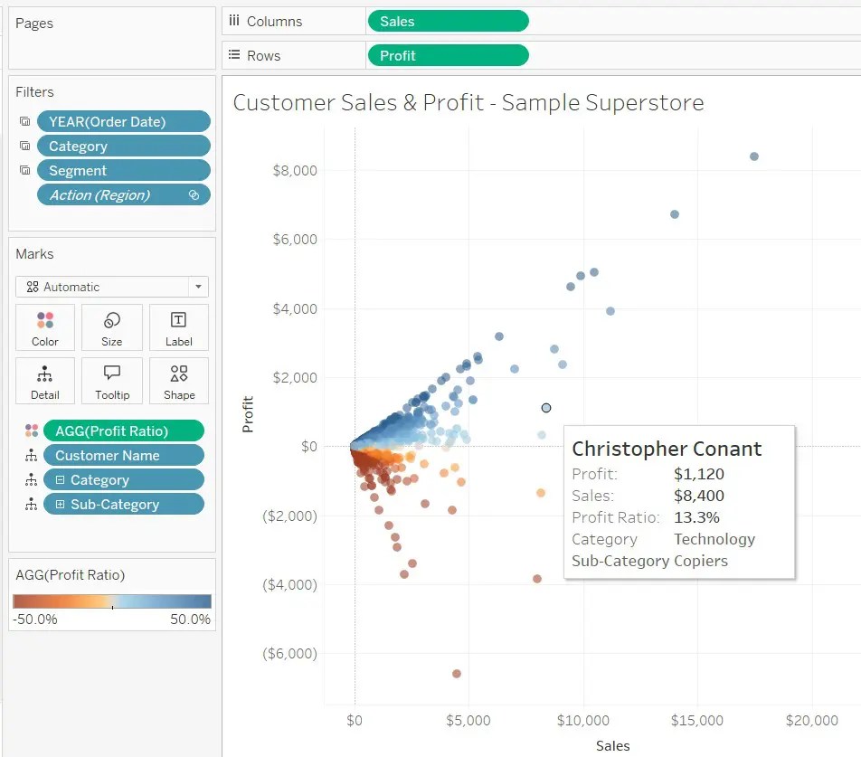
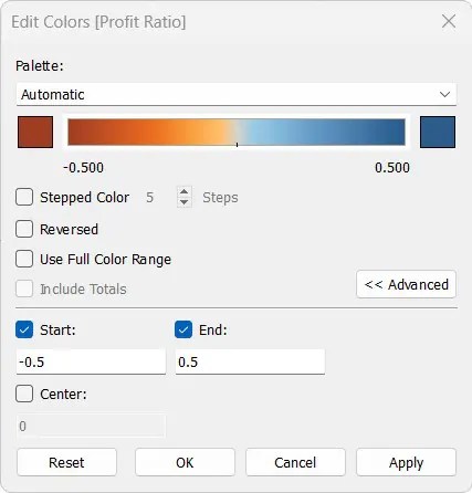
Profit Ratio is the sum of profit divided by the sum of sales and is represented by the formula SUM([Profit])/SUM([Sales]). Profit ratio can also be called profit margin. Drag it over to the Color marks card. Profit ratio is also know as profit margin, and of course sales is also known as revenues. Select Shape and choose the filled circle. Click on Color, Edit colors. Click the Advanced button and we’ll start at minus 50% and go to positive 50%, as shown below.
If desired, you could change the size of each dot by first clicking on Size. It’s about your own opinion on the aesthetics of the plot. One thing I recommend is to change the opacity in the Color card. The colors a bit too bold when they overlap.
Tooltips
I want the tooltips to show more information when I hover over the dots. How do I do that? Drag the pills that contain the information you want to show over to the Detail card. So, drag Customer Name onto Detail and drag Region to the Detail card. Click Tooltip and make some aesthetic adjustments as desired.
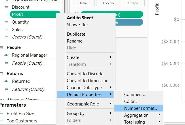
Default Properties – Number Format
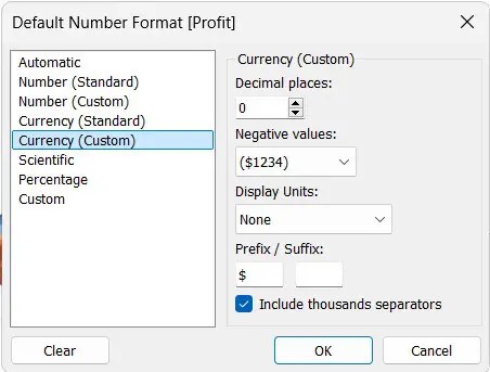
We want our axes and tooltips to show the dollar sign because the Profit is a currency. The profit can be positive or negative. Below is the screenshot to show how we set the default properties of Profit. Do the same for Sales. A dialog box will open up.
Below is the screenshot of the dialog box.
I have added some filters so that we can have those in the dashboard I will create later. Here is the screenshot. I am hovering over one of the dots. I’ve added pills to the detail mark so I could show more information in the tooltip. When you click on Tooltip, there is an insert drop down in the upper right corner of the dialog box. Use it to insert fields, such as Category and Sub-category.