- Scatterplots in Tableau
- Customer Sales Ranking in Tableau
- Customer Overview in Tableau
- Tableau Superstore Customer Dashboard
Using the included dataset Sample – Superstore, let’s build the top of our dashboard by displaying several metrics as a series of bar charts running from left to right. We will make a sheet now that we will add to the dashboard at a later time.
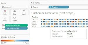
Here’s how we get started. Drag Region over to Rows and drag Profit Ratio to Columns. Click Color in the Marks area. Edit Colors. Click Advanced. Click on the Start and End check boxes and put -0.5 and 0.5 as the start and end points.
In the aggregate, each of the four regions are profitable and therefore show a blue box.
Drag the Customer Name over to Details. Here is what you get. Click on the screenshot on enlarge it.
It shows each customer as a small box. Now go over to the blue pill Customer Name, click the down arrow on the right side and go down to Measure and then over to Count Distinct. What happens? We’re back to the same visualization with the four shaded blue blocks for each of the regions. The pill has turned green. Green means continuous.
Drag the Sales to the Detail on the Marks card. Drag Quantity to Detail on the Marks card.
Calculated Field
In the Data pane on the left, click the down arrow of Sales and choose Create, then choose Calculated Field… A dialog box appears. We will name it Sales per Customer. What is the formula? Here it is: Sum([Sales])/countD([Customer Name]). Drag it over and put it in Detail as well. Drag Profit and Profit Ratio to Details as well.
Measure Values
Now drag Measure Values to Columns. Measure Values will be in the Data pane in the Measures section. Click on the screenshot below to enlarge the picture.
Measure Names
Now we will drag Measure Names over into Columns. What does this do? It generates multiple bar charts for each of the Measure Values. You may get more than you really need. We can drag some of those extra ones away. For example, AVG(Discount) doesn’t really make sense because they are percentages and it doesn’t make sense to merely take an average of percent. Also drag away the sum of number of records. We drag away the unwanted ones from the lower list of Measure Values. Click Labels in the Marks card and add labels.
In the screen shot I am just about to get rid of the axes under each graph where it has an axis and the word Values. Right-click and uncheck Show Header by clicking on Show Header. It’s easy to change the order of the charts by just dragging the green pills in the lower set of pills.
Tooltip
Click Tooltip and adjust as you see fit. Maybe remove the word Region as it’s obvious. Make the region bold and a larger font size. Change distinct Count of Customer Name to Number of Customers.


