What is a control chart? Control charts are graphical plots used in production control to determine whether quality and manufacturing processes are being controlled under stable conditions. Control charts, also known as Shewhart charts (after Walter A. Shewhart) or process-behavior charts, are a statistical process control tool used to determine if a manufacturing or business process is in a state of control.
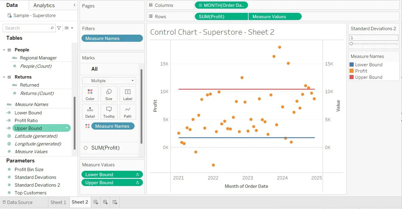
As a data analyst you need to be able to understand the range of your data. A control chart helps with that. We can use standard deviations. An amount is sometimes considered to be “outside the norm” if it is more than two standard deviations away from the mean, but it depends on the circumstances.
Tableau
In Tableau, we are going to use a parameter and calculated fields.
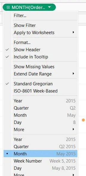
As our example, we’ll use the Sample – Superstore as our dataset. In Tableau Desktop, open a sheet. In the Orders table, drag the Profit pill to the rows which will put the profit on the y-axis. For the x-axis we’ll use the Order Date. Drag that pill to Rows. Now change it to Month.
In Marks, change it from Automatic to Circle. We have time on the x-axis. Normally we would use a line graph for this but we are going to make it look similar to a scatter plot, but it’s not a scatter plot.
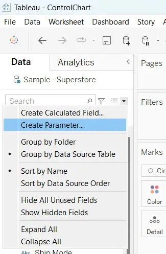
Give it a name such as Standard Deviations, make it an integer (not a float) and set the range from 1 to 5. On the left side of the screen, under Parameters, click the drop down of our new parameter and click Show Parameter so that it appears on our graph in the upper left side. That’s all we’ve got right now is just a parameter that doesn’t do anything yet.
We need to add two horizontal lines to our chart, where one is called Lower Bound and the other is called Upper Bound. We can see from the above screenshot that we can create a calculated field by clicking on Create Calculated Field…. We give it a name and the interesting (trickier) part is the formula. Below are the two formulas, first the Lower Bound, then the Upper Bound.
WINDOW_AVG(SUM([Profit])) - (WINDOW_STDEV(SUM([Profit])) * [Standard Deviations])
WINDOW_AVG(SUM([Profit]) + (WINDOW_STDEV(SUM([Profit]) * [Standard Deviations])))
After completing those, drag each one right over to the right side of the visualization’s edge to create a dual-axis. You will see two lines of horizontal dots. Here is the upper and lower formulas.
- WINDOW_AVG(SUM([Profit]) +(WINDOW_STDEV(SUM([Profit]) * [Standard Deviations])))
- WINDOW_AVG(SUM([Profit])) – (WINDOW_STDEV(SUM([Profit])) * [Standard Deviations])
There is something else we need to do. We need to synchronize. Double-click the vertical axis on the right-hand side to open the Edit Axis dialog box. Check the synchronize dual axes check box and click OK to update the setting (if you have an OK button).